When you size something in CSS with a percentage, you’re telling the browser, “Make this element’s size relative to another element’s size.” That’s different from fixed units like pixels, where the measurement is absolute.
Percentages depend on their parent
If you set width: 50% on a div, it doesn’t mean “half the screen”. It means “half the width of the parent container.” That parent could be the body tag, a section, or another nested element. Change the parent’s size, and the child adjusts automatically.
Why percentages are powerful
Percentages work well in responsive design.
They let layouts stretch or shrink to fit different devices without having to hard-code multiple values.
Use percentages when:
1. You want a container to adapt to varying screen widths
Percentages let containers stretch or shrink relative to their parent, which is perfect for responsive design. For example, setting a container’s width to 80%:
- On a large desktop monitor, it will still take up 80% of the available space, leaving balanced margins on the sides.
- On a small tablet, it will scale down proportionally without you needing separate CSS for that exact size.
This keeps layouts consistent while avoiding horizontal scrolling, which is crucial for usability.
2. Images need to scale proportionally inside a flexible layout
One of the most common percentage tricks is making images fluid.
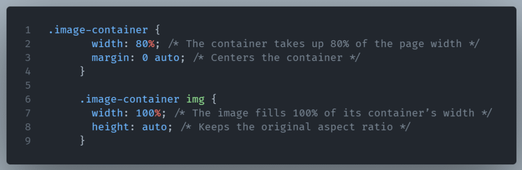
Here, the image always fits its container, no matter the container’s size. This is especially important for:
- Hero banners that need to look good across desktop, tablet, and mobile
- Product images in e-commerce layouts
- Content images in blogs that adjust to various column widths
It prevents awkward cropping or overflowing images when the design shrinks.
3. You’re building fluid grids or cards that adjust automatically
Percentages are perfect for grids that reflow as the viewport changes. For instance, you might create three cards across at width: 33.33% each. On a wide screen, all three appear in a row; on a narrower screen, they wrap into two or even one per row, without needing to hardcode exact breakpoints.
This is the core principle behind flexible design: instead of telling elements their exact pixel width, you let them adapt based on available space.
Percentages let your layout “breathe” with the screen size. Instead of breaking when the device changes, your elements naturally reorganize themselves without extra media queries. It’s like giving your site built-in adaptability.
When to be cautious
Percentages can create unpredictable results if the parent’s size isn’t well-defined. They can also cause issues when mixed with absolute positioning or fixed dimensions.
When the parent’s size isn’t well-defined
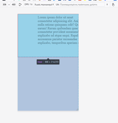
Percentages in CSS are relative measurements. If the parent element doesn’t have a set size (either directly or indirectly through its own parent), the browser has nothing concrete to base the percentage on.
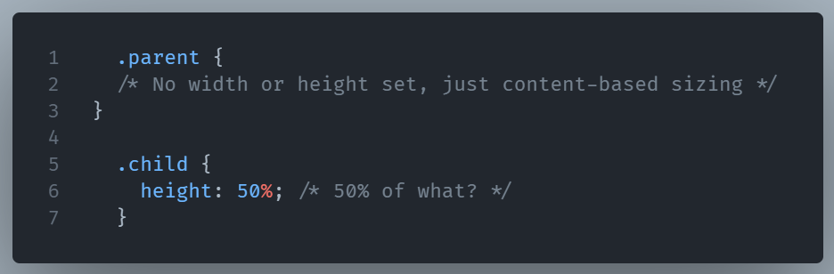
Here, height: 50% won’t work as expected because the parent’s height is determined by the child’s content.
The result might be:
- The child’s height collapses to
auto - The browser ignores the percentage entirely
In contrast, width is easier because it often inherits the flow of the page and has a definite value.
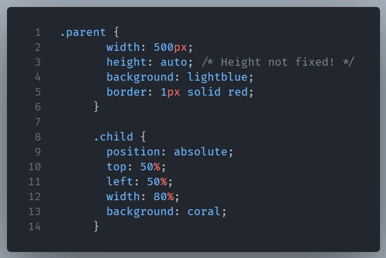
Mixed with absolute positioning
When you position an element absolutely (position: absolute), percentages are calculated relative to the containing block—which might not be the element you expect.
When the size of the containing block is not fixed, the child’s size can shift during layout changes.
If the parent resizes due to responsive content changes, left: 50% will shift unexpectedly—sometimes breaking your intended alignment.
And the result is:
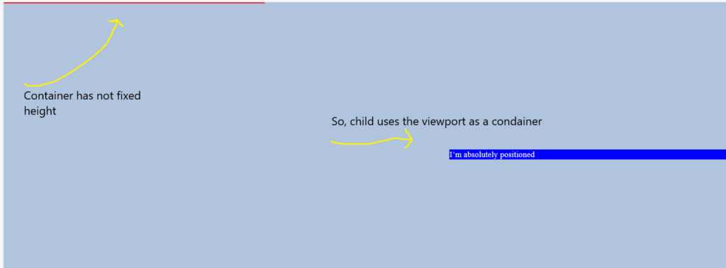
What happens here?
.parenthas nopositionset, so it’sstaticby default..childisposition: absolute, so it looks for the nearest positioned ancestor—none found—so it uses the viewport as its containing block.top: 50%andleft: 50%are calculated relative to the viewport, not the.parentelement.- Because
.parent’s height is not fixed,.childmay overlap or float far outside.parentdepending on the page layout.
Fixing it
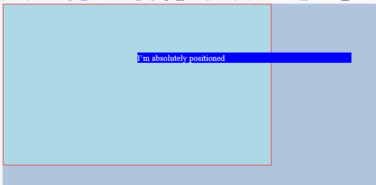
If we want .child’s percentages to be relative to .parent, we need to explicitly position .parent:
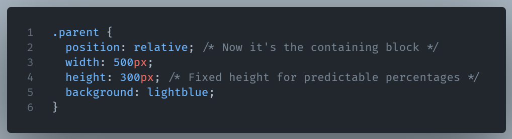
And the result is what we wanted in the first place:
Combined with fixed dimensions
If you mix a percentage-based property with a fixed pixel dimension in the same layout, you can run into awkward scaling issues. For example, a width: 80% container with padding: 100px on both sides might look fine on desktop, but shrink too much on smaller screens, leaving too little content space.
In short, percentages are only predictable when their reference size is predictable. If the parent is fluid, or undefined, you might need to set clearer boundaries—using min/max values, flexbox, or grid—to keep layouts stable.
Percentages in CSS give you adaptability without needing constant recalculation.