The CSS units em and rem are both relative units. Relative units mean they size things based on something else. This “something else” is subtle, yet it can completely change how your layout behaves.
Understanding the “em”
The em unit is relative to the font size of its current element.
If the paragraph’s font size is 16px, 1em in that paragraph is 16px.
But if you nest elements and apply more font-size changes, ems compound. For example, a child element with 1.2em font size inside a parent set to 20px will render at 24px. This cascading nature is powerful, but it can also be a little unpredictable if you’re not careful.
For example:
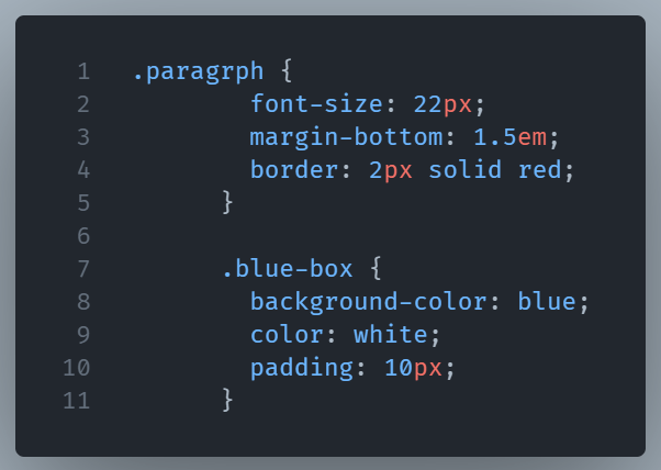
For the paragraph class, we set the font-size to 22px and the margin-bottom to 1.5em. This means that the margin will be 1.5 times the font size of the paragraph element. 1.5em results in 33 pixels of margin at the bottom of the paragraph
The “rem” Difference
rem stands for “root em,” and it ignores the parent’s size entirely. It’s always relative to the root element (html), which is usually 16px by default. That means 1.5rem will always be 24px no matter where it’s placed in the document.
Your browser settings let you modify the default font size. Therefore, individuals with vision problems can make the text bigger for easier viewing.
However, if you use pixels for font sizes, text won’t scale with your content.
You can fix this by using rem units for typography.
Typography benefits from rem units rather than pixels because they scale proportionally with browser settings. This improves your content’s usability for visually impaired users.
rem units also help to provide consistent spacing and layout across different elements.
Here’s how you can use rem units for font size instead of pixels:
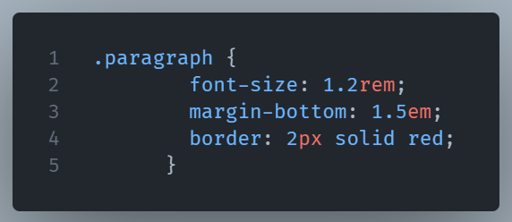
When you set the font size to 1.2rem, the font size of the paragraph element will be 1.2 times larger than the root element’s font size. If the user has changed the default font size to 20px, the font size of the paragraph element will be 24px because it is 1.2 times 20px.
So when do you use which?
A useful guideline is:
- When you need an element to scale relative to its parent, use
em. For example, when you want buttons contained in a larger heading, ems make sense. - Use
remwhen you want consistent sizing across the entire page. It is perfect for base typography, padding, and margin spacing.
Here’s the diagram showing how ems scale with their parent’s font size, while rems stay fixed relative to the root element. This makes it clear why rems keep things consistent, and ems allow for proportional scaling.
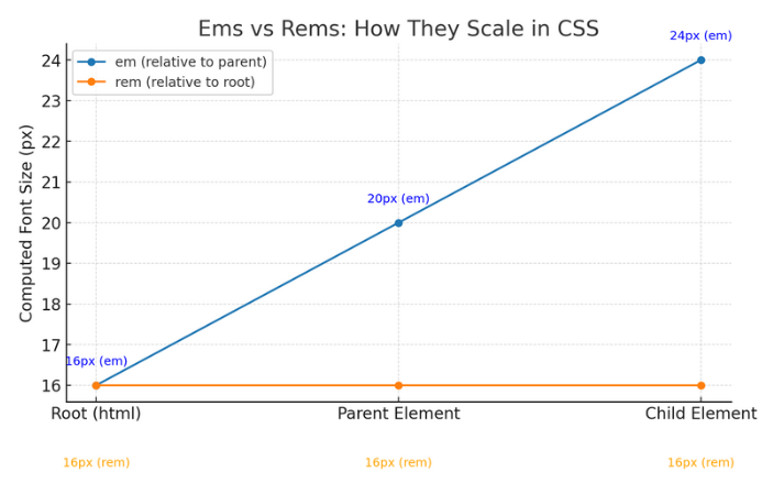
What the lines mean
- Blue line =
em(relative to the parent).
At the root (html) the computed font-size is 16px. The parent element is set inem, so it scales from its parent’s computed size to 20px. The child is also set inem, so it scales again—from the parent’s 20px—to 24px. Result: the blue line climbs as you nest elements because each step compounds on the previous one. - Orange line =
rem(relative to the root).
No matter where you are—root, parent, or child—the computed value stays tied to thehtmlsize (16px in this example). So the orange line is flat at 16px the whole way.
Many developers use these units interchangeably. They’ll define global type sizes in rems, then use ems inside components so scaling feels natural.