When you’re styling a webpage, one of the first questions you’ll ask is: How big should this be? That’s where units come in. Understanding absolute units is key to making confident design decisions.
Let’s break it down.
Fixed and Firm: What Are Absolute Units?
In CSS, absolute units represent fixed-size values. These units, don’t take into account screen size, or zoom level.
Some common absolute units include:
px(pixels)pt(points – typically used in print)in(inches)cmandmm(centimeters and millimeters)pc(picas – another print unit)
To the browser, 1 inch equals exactly 96 pixels. So if you write:
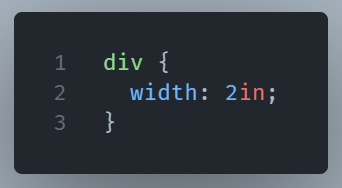
You’ll get a box that’s always 192 pixels wide. No matter the device and the context.
That sounds good, but what’s the drawback?
Absolute units seem great because they’re predictable. But that predictability can be a double-edged sword.
Unlike relative units (like em, %, or vw), absolute units don’t respond to the user’s environment. That might cause layout issues on small screens or high-resolution displays. For example, text sized in pt might look tiny on a phone but enormous in print.
That’s why designers tend to avoid using them for responsive layouts. The web is dynamic. Your styles should be too.
When Should You Actually Use Them?
Good question. There are times when absolute units shine:
- Print stylesheets: If you’re designing something to be printed (like an invoice or label), absolute units ensure real-world measurements.
- Fixed-size elements: For very controlled UI components (like canvas drawings or icon sizing), a fixed pixel count might be preferable.
- Legacy systems: Sometimes, older systems or third-party tools rely on pixel-precise layouts.
That said, for everyday layout and typography go relative whenever you can.
Wrapping Up: A Tool, Not a Crutch
Absolute units have their place. You can use them when precision matters more than flexibility. But if your site needs to work well on all screen size you mainly need responsive units.