If you’ve ever tried to place two block-level elements side by side, or wished you could apply padding to an inline element, you’ve likely run into the limits of CSS display types.
That’s where inline-block steps in. It offers the best of both worlds, but also comes with a few quirks.
Let’s walk through what it is, how it behaves, and where it fits between inline and block.
Quick Recap: Inline vs. Block
Before we get to inline-block, here’s a refresher:
- Inline elements flow with text. You can’t set their
width,height, or vertical margins. Such elements are<span>,<a>, or<strong>. - Block elements break onto a new line and stretch to fill the horizontal space. You can style them however you like. You can style their
width,height, margins, paddings, freely. Some popular block elements are<div>,<p>, or<section>.
But what if you want something that can sit next to other elements, but still have a box model you can fully control?
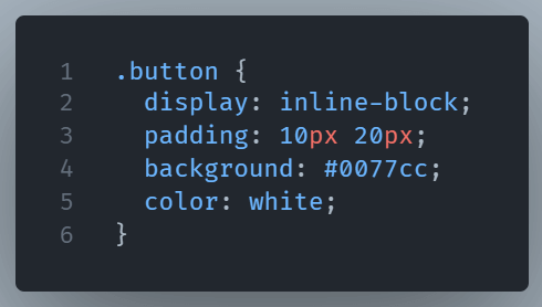
Enter Inline-Block
An element with display: inline-block behaves like an inline element in that it doesn’t force a new line, it can sit next to its siblings. But, unlike true inline elements, you can style it like a block. You can set its width, height, padding, and margins.
Here’s a simple example:
Is there a downside?
However, there’s a small problem: spaces between inline-block HTML elements are visible. It behaves like literal space between words. If that spacing bothers you, you’ll need to remove it in the markup or manage it with negative margins.
The Whitespace Problem: Why It Happens
When you use display: inline-block, your elements behave visually like inline elements. That means spaces, tabs, and line breaks in your HTML count as literal whitespace between those elements.
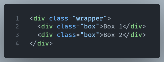
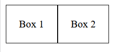
Here’s an example:
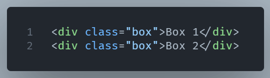
Even if both .box elements are styled with display: inline-block, they’ll have a visible space between them on the page. Why? Because there’s a newline (or space) between the </div> and <div> in the source code, and inline-level elements interpret that as text spacing just like a space between two words.
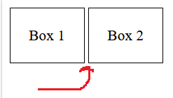
It’s not a bug. It’s how the browser renders inline content by default.
How to Fix or Manage That Space
You’ve got several ways to deal with this. Each has pros and cons, depending on your project and workflow.
1. Remove the Whitespace in HTML
Put the tags right next to each other:
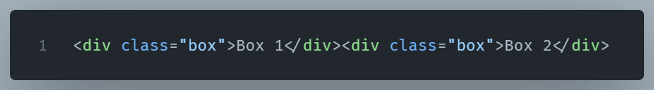
No space between them equals no visual gap. It is clean, but slightly harder to read.
2. Use HTML Comments
You can trick the browser like this:
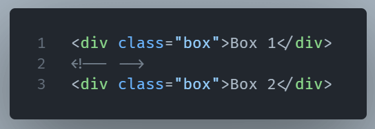
This visually removes the gap, but keeps your HTML readable.
3. Set Font Size to 0 on the Container
Another CSS trick: set font-size: 0 on the container element to eliminate the inline spacing, then reset it inside the children:
And this is the CSS:
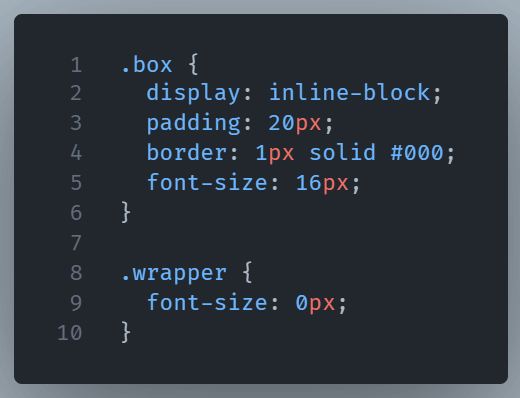
This suppresses any whitespace entirely which is handy for layout-heavy designs.
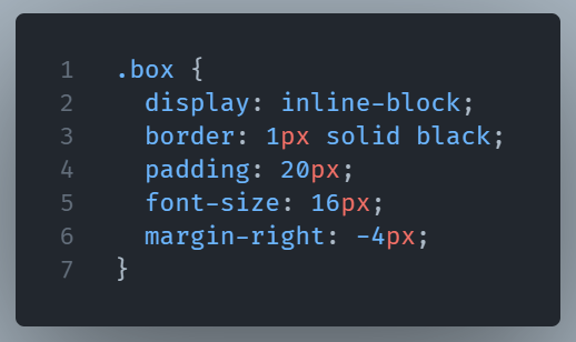
4. Use negative margins
This is more of a hack than a solution. We try to manually remove the gap with negative margins. It used to be popular back in the day but the 5th way (displayed next) is now the go to solution.
5. Use Flexbox or Grid Instead
If your layout needs more flexibility, Flexbox or Grid can sidestep these quirks entirely. inline-block is great for simpler cases, but you don’t have to struggle with it.
Why This “Catch” Matters
For beginners, that unexpected space can feel like something’s broken. You might check your margins, paddings, or even borders,but not realize the HTML itself is the culprit.
Knowing about this spacing issue helps you avoid hours of head-scratching layout debugging. It also gives you a deeper appreciation for how HTML and CSS work together, not just in isolation.
Wrapping Up
The inline-block property is flexible, efficient, and surprisingly powerful.
It gives you layout control without forcing a line break, making it perfect for menus, buttons, thumbnails and anything that needs structure but still plays nicely in a row.