As a web developer you often need to create complex layouts. CSS Grid helps you do just that.
CSS Grid is a powerful layout system that organize elements into rows and columns. To implement it, simply set the display property of a parent element to grid.
Let’s see an example:
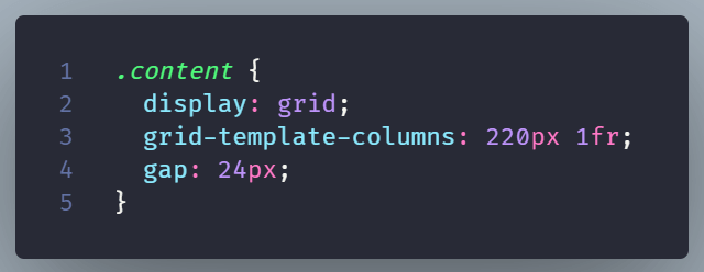
Using the grid-template-columns property you can create as many columns as you wish.
The gap property defines the space between the columns. The child elements inside the parent element with the .page class are the grid items. You can place these items into specific columns or rows thus obtaining more control over your layout.
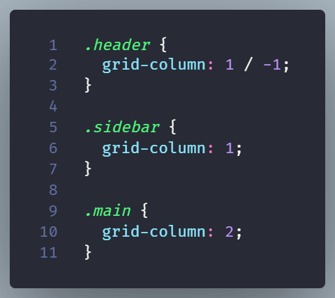
CSS Grid works in two directions
CSS Grid controls rows and columns at the same time.
This makes it a good choice for designing layouts that include both rows and columns.
As an example you can use it to develop a page layout or/and a dashboard layout.
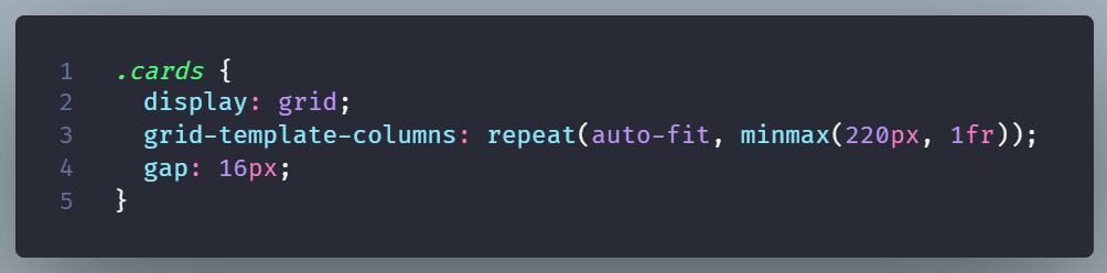
Let’s see the example of a responsive card grid:
How Flexbox is different
Flexbox can stretch either horizontally or vertically. But not in both directions simultaneously!
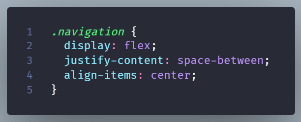
It’s usually the best option for content that needs simple alignment.
A navigation bar is such an example:
A rule of thumb is to use CSS Grid for the larger page layout and Flexbox for smaller groups of items inside that layout.
Flexbox and CSS Grid are not competing systems. Many interfaces use both, with CSS Grid setting the structure and Flexbox handling the details.