When building a web page, you often need to align elements side by side, center content, or maintain equal spacing between different items. With the introduction of CSS Flexbox, arranging elements like that has become much simpler.
In the past, these tasks required complicated solutions such as using floats, tables, or complex positioning methods.
Flexbox, an acronym for Flexible Box Layout, is a layout system designed for positioning elements in a one-dimensional space. It allows for a simple way to position items in a container, which helps keep your code clean and maintainable.
One-dimensional means that Flexbox controls the layout along one axis at a time. You choose whether that axis is:
- Horizontal (a row)
- Vertical (a column)
It can organize items in a single direction, but it isn’t built to handle both rows and columns at the same time.
With Flexbox, the browser handles much of the layout work, so you spend less time calculating widths and margins.
Flexbox depends on a parent-child relationship.
To start using it, apply display: flex to a parent element.
Once a parent element becomes a flex container, all of its children become flex items. You can then use additional properties such as justify-content, align-items, and gap to control how those items are displayed.
For example, the following code places items in the center of the container:

Flexbox is a great option when you want to organize items in a single direction.
Some common cases are:
- Navigation menus
- Button groups
- Galleries
- Cards displayed in a row
- Header and footer layouts
- Toolbars
One of its biggest strengths is flexibility. Suppose you have two cards in a row. If one card contains more text than the other, Flexbox can adjust the available space without breaking the layout.
The flex-wrap property
Flexbox makes responsive design easier because items can wrap onto a new line when there is not enough room.
It achieves that with the use of the flex-wrap property.
The property flex-wrap can have three different values: nowrap, wrap, and wrap-reverse. The default value is nowrap, which means that flex items will not wrap onto a new line, even if their combined width is greater than that of the container.
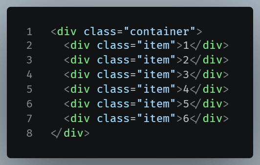
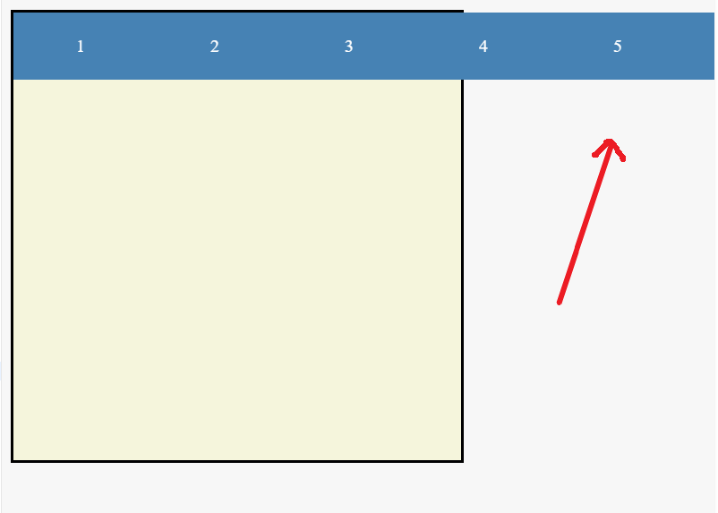
To allow items to wrap when they exceed the container’s width, you should use flex-wrap:wrap.
flex-wrap: wrap is commonly used for:
- Card layouts
- Photo galleries
- Product listings
- Tag or badge lists
- Groups of buttons
- Responsive navigation menus
It allows the layout to adapt naturally as the available screen width changes.
When is it not the best tool?
Flexbox isn’t a universal solution for all layout challenges. It’s most effective for one-dimensional layouts, where you need to organize content in either a single row or a single column. If you need to build a complete page with multiple rows and columns, CSS Grid is usually a better choice because it was designed for two-dimensional layouts.
Conclusion
Flexbox is a layout tool. It typically offers the simplest way to align, distribute, or center a collection of elements. Once you become familiar with its basic properties, you will find yourself using Flexbox in almost every website you build.