One of the biggest advantages of flexbox is how easily it aligns elements. However, not every flexbox alignment property works the same way.
Some control the position of the entire group of flex items, while others affect only a single item. Understanding this distinction makes flexbox much easier to use.
Content-level alignment
The flex container uses content-level properties to affect how all flex items are arranged within the available space, instead of concentrating on the movement of just one item.
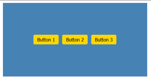
For example, suppose you have three buttons inside a navigation bar.

If you want to center the buttons inside the nav you assign the value of center to both justify-content and align-items properties:
Here, both properties affect every button inside the container.
justify-contentpositions the entire group along the main axis.align-itemspositions the entire group along the cross axis.
If you change justify-content to space-between, every button moves because the browser is arranging the group as a whole.
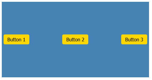
Consider the flex items as a team. The content-level properties guide the whole team on where to stand.
The align-content content-level property
When does align-content work?
For the align-content property to have any effect on the page layout, all of these conditions must be true:
-
display: flex -
flex-wrap: wrap(orwrap-reverse) - Multiple flex lines
- Extra space in the container along the cross axis
If even one of these conditions isn’t met, align-content has no visible effect.
For that reason, align-content is used much less frequently than justify-content or align-items, but it’s invaluable when you need to control the spacing between multiple wrapped rows or columns.
Item-level alignment
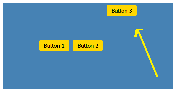
Sometimes one item needs special treatment. Maybe one button should sit lower than the others, or one card should appear at the top while the rest remain centered.
That’s where align-self is handy.
Only the element with the special class changes position. The remaining items stay where they are.
When should you use each?
As a general rule:
- Use content-level properties when every flex item should follow the same alignment.
- Use
align-selfwhen one item needs different positioning.
In everyday development, justify-content , and align-items , are used far more often than align-self. Most layouts keep their items aligned consistently, while exceptions are relatively rare.
Conclusion
It’s essential to recognize the distinction between group alignment and individual alignment to fully comprehend Flexbox. When you determine whether you’re working with the entire group or a single item, it simplifies choosing the appropriate property.