The CSS clamp() function allows you to set a value that stays within a defined minimum and maximum range, while also providing a preferred value for CSS to target. The function uses three parameters: minimum, preferred, and maximum.
The syntax looks like this:
font-size: clamp(1rem, 2vw, 2rem);
In this scenario, the text can expand as the viewport changes due to the 2vw, but it will remain within the range of 1rem to 2rem.
This is the main benefit of using clamp(). It provides flexibility but also ensures that there are clear boundaries.
Why Developers Use It
Before clamp(), responsive sizing often meant writing several media queries just to control one property. With clamp(), you can often express the same idea in one line.
Let’s look at a concrete example showing the same responsive font sizing done first with media queries, then with clamp().
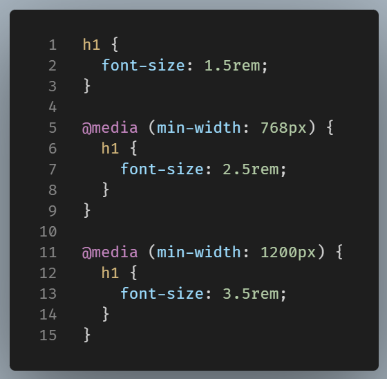
While this method is functional, it follows a step-by-step approach. The size jumps at breakpoints rather than scaling smoothly.
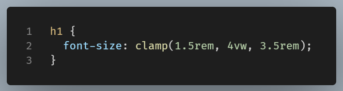
Now, instead of jumping at specific breakpoints, the size grows more fluidly between the minimum and maximum.
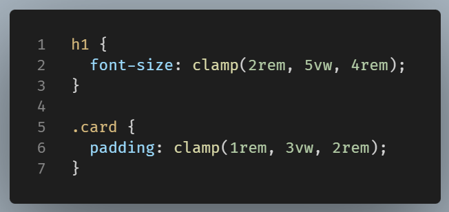
The clamp() function can be used to control sizing, spacing, and fluid typography in responsive layouts.
That makes it useful for:
- font sizes
- padding
- margins
- widths
- gaps between elements
For example:
How It Works in Practice
Consider clamp() as a three-part rule.
CSS checks the preferred value first. If that value falls below the minimum, it uses the minimum instead. If it rises above the maximum, it uses the maximum. Otherwise, it keeps the preferred value.
That is why clamp() is often described as combining the ideas behind min() and max() into one expression.
Final Thought
clamp() helps you write responsive styles with less repetition and more control.
With just one line of clamp(), you can accomplish a lot more, and it’s often easier to manage than a series of media queries. This method reduces the need for multiple rules and functions.