UI (user interface) elements are the building blocks of user interfaces in apps and websites, including components like buttons, text fields, and icons that users interact with. They help create a user-friendly experience by guiding user actions and presenting information in a clear and concise manner.
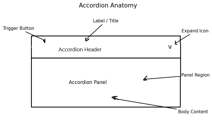
An accordion is a UI element that lets users hide or reveal content in different sections. Its logic is simple. When a user clicks a heading, the related panel opens. Clicking again, and it closes.
Accordions help reduce visual clutter. They help make lengthy pages feel lighter and more manageable., but at the same time, they can hurt usability when they hide content that users need to compare quickly.
So the first rule is practical: use an accordion when space is limited or when content is secondary, not when everything deserves equal attention.
Best Practices That Keep An Accordion Clear
A good accordion makes its behavior obvious. Each section title should be specific.“Shipping and returns” works better than “More info.” Labels should clearly indicate to users what they will receive before they click.
A larger clickable area is helpful since small targets can cause issues. The latter can also be caused by poor visual cues. A plus icon, chevron, or clear open state helps create a more organized interface.
For accessibility, use proper HTML buttons for the headers and connect them to the content panels with ARIA attributes when needed. Keyboard support matters too. A user should be able to tab, open, and close sections without needing to use a mouse.
Below is an example demonstrating how to construct an accordion:
A Few Practical Examples
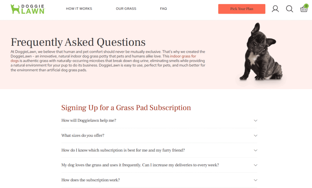
Accordions are great for organizing FAQ sections and product detail tabs on smaller screens. They help keep the page looking neat while still providing access to additional information.
They work less well when users need to read several sections side by side. Pricing comparisons are a good example. If content must be compared, hiding it behind collapsible panels slows people down.
Common Mistakes to Avoid
One common mistake is stuffing too much content into each panel. If a section opens into a wall of text, the accordion is only hiding the problem. Another is nesting accordions inside accordions. That can turn a clean interface into a maze.
There is also the issue of the state. If one panel opens, should the others close? That depends on context. For FAQs, multiple open sections often work well. On the other hand in the case of a compact mobile menu, one open section may feel cleaner.
Final Thought
A well-crafted accordion should effortlessly guide users through the content, making their experience simple and clear. When labels are straightforward and easy to understand, interactions become smooth, and the use of hidden content is minimal, which truly enhances the overall design of the interface.