If your layout breaks for no apparent reason, there’s a good chance the CSS box model is responsible. And more specifically a small property called box-sizing.
So, what is box-sizing?
The box-sizing property tells the browser how to calculate the size of an element. That includes the content, padding, and borders. You’ll encounter two primary values: content-box (the default) and border-box.
content-box: the default behavior
When you use box-sizing: content-box, the declared width or height applies only to the content. Padding and border are added outside that box.
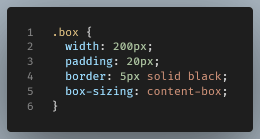
This box, if displayed on a browser, would look wider than 200px—because padding and border add extra space. If you aren’t expecting it, it could surprise you.
border-box: the more practical behavior
With box-sizing: border-box, the total width includes padding and border. The content shrinks to fit inside.
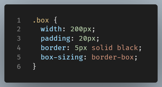
The padding and border are part of the size of this box. This is a clean, and predictable layout.
Side-by-side demo
The below side-by-side comparison, makes the difference crystal clear.
Both boxes declare the same width (200px) and height (100px).
The content-box box will appear larger overall—because the padding and border are added outside the content area. The border-box box will look smaller visually, but it’s actually correctly sized—because padding and border are contained within the 200×100 dimensions.

And this is the result on our browser:
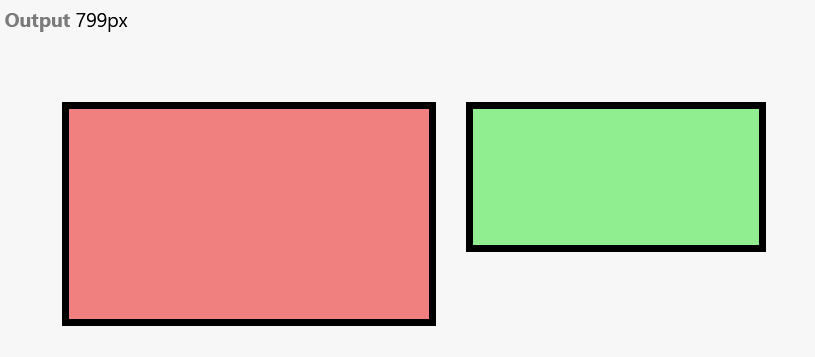
content-box declared size is just the content, contrary to border-box declared size, which is the entire box.
Which one should you use?
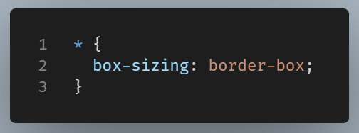
Use border-box unless you have a very specific reason not to. It makes layout math simpler—especially when you’re building responsive designs or working with flexible grids.
In fact, many developers reset all elements like this:
Conclusion
Although the difference between content-box and border-box seems minor, it has a big impact on avoiding messy debugging and achieving a clean layout.