While they’re not part of the physical anatomy of type (like stems, bowls, or ascenders), kerning, tracking, and leading are all part of typography’s spacing behavior. Τheυ define the way type behaves in space.
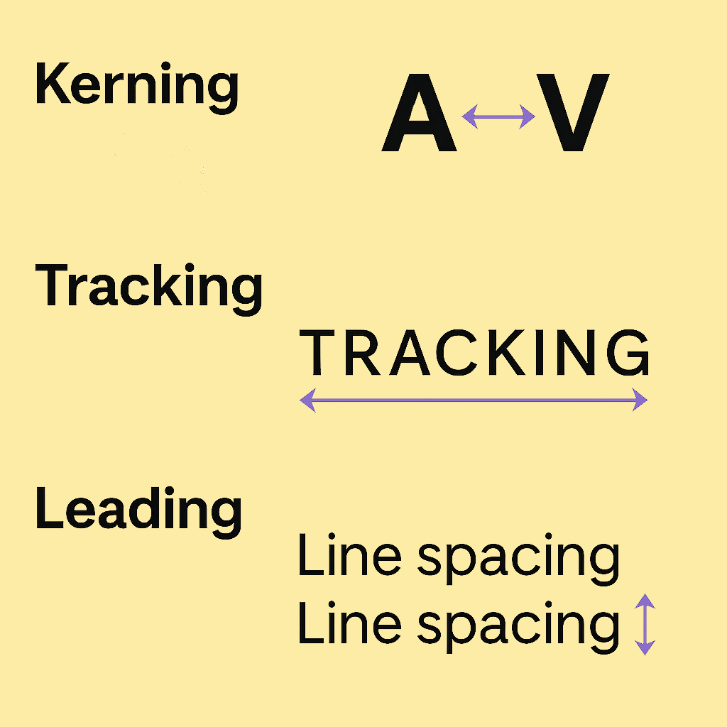
Let’s define them clearly:
Kerning
Kerning adjusts the space between individual characters, based on their shapes.
For example the letters A and V often need to be moved closer together for visual balance.
In CSS, kerning can be enabled with:
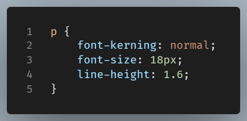
Use it when: You’re using custom fonts that support kerning pairs and want natural, polished spacing.
Tracking
Tracking adjusts the spacing across a whole word or line of text, evenly.
Unlike kerning, tracking applies a consistent space to all characters.
You control it with CSS:

Use it when: You want tighter or looser spacing across entire blocks of text (like headlines or uppercase labels).
Leading
Leading (pronounced “ledding,” from traditional typesetting) is the vertical space between lines of text. It defines space from baseline to baseline.
In CSS, it’s controlled with line-height.
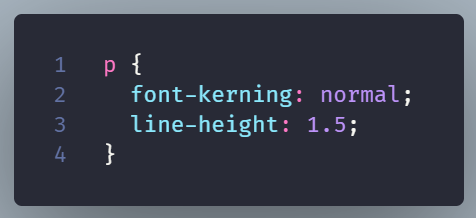
Use it when: You want to improve readability, especially in paragraphs. Too tight? Text feels cramped. Too loose? It feels disjointed.
Conclusion
We have talked about anatomy in a previous post. It is the shape of the characters.
Spacing behavior is how those characters sit next to and above/below each other.
When you learn to balance both, you go from just using fonts to actually using types as elements of design.