When you’re styling text on the web, the font you choose defines not just how the app looks but also its character, readability and performance.
Underlying every CSS font choice is a more complex system: the font family.
If you’re new to web design or CSS, understanding font families will help you make better choices when writing styles that render well across devices and browsers.
So, what is a font family?
A font family is a group of typefaces that share a similar design. Think of it like a family with different members that shares the same DNA but have slightly different personalities.
Take Arial, for example. The Arial font family includes:
- Arial Regular
- Arial Bold
- Arial Italic
- Arial Black
They all share the same basic structure, but each style variation serves a different purpose. When you declare a font in CSS, you’re often pointing to a specific typeface within a font family.
Types of generic font families
There are five core generic families in CSS:
serif– with decorative strokes (e.g. Times New Roman)sans-serif– clean, modern, minimalistic (e.g. Arial, Helvetica)monospace– all characters are the same width (e.g. Courier)cursive– script-style (e.g. Comic Sans, brush fonts)fantasy– decorative, mostly for fun (rarely used in practice)
Be sure to include one of these at the end of your font stack so text still shows if a specific font isn’t.
What Is Font Stacking?
Font stacking is the practice of listing multiple fonts in a font-family property so that if one font isn’t available on the user’s device, the next one in line is used.
It’s essentially a fallback system.
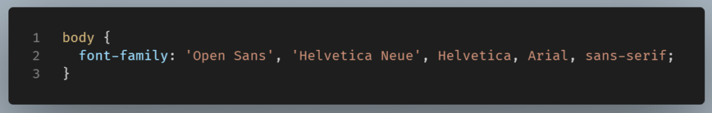
This is a font stack. The browser goes through each font in order:
- Try
‘Open Sans’ - If not available, try
‘Helvetica Neue’ - Then
Helvetica - Then
Arial - Finally, default to the generic family
sans-serif
This ensures your text remains readable and fails gracefully if web fonts fail to load or aren’t supported.
Why Stack Fonts?
Font stacking keeps typography similar across different devices and helps performance – wise by letting browsers use local fonts, if available, thus speeding up render time.
Font Stack Best Practices
- Always end with a generic family (
serif,sans-serif, etc.) - Match font style – Use fallbacks that look fairly similar in tone.
- Mind casing and spacing – Multi-word font names require quotes (
‘Open Sans’) - Use web-safe fonts near the top or as backups when possible
What is a web-safe font?
A web-safe font is a font that comes pre-installed on most computers and devices, ensuring it will display correctly for most users without requiring a download from the website. These fonts are “safe” because they are widely available across operating systems and browsers, leading to consistent visual presentation.
Why font families matter?
Fonts influence both aesthetics and accessibility. Using a good font increases readability, sets the mood, and improves the look of interfaces. But a poorly chosen font, or a font with no fallback set, can make your site look broken or inconsistent.
NOTE: not every font is installed on every device. That’s why web-safe font families and smart font stacks are essential.
Final Thought
When you understand how font families work, you can write CSS that gracefully degrades, renders beautifully, and respects both branding and user experience.
Whether you’re using system fonts, Google Fonts, or custom web fonts, the right font families keep your typography consistent, reliable, and accessible.