In CSS, sometimes we need styles that change based on a special state or condition of an element. That’s where pseudo-classes come in. They’re like CSS’s way of saying, “When this happens, use this style.”
You see these pseudo-classes very often. When you hover over a link and it changes color; that’s: hover in action. When you click a button and it stays highlighted; that’s: active.
Pseudo-classes are not new elements. They’re “hooks” into existing ones, triggered by things like user interaction, DOM position, or input validity.
Practical Pseudo-class Examples
Pseudo-classes have a wide range of uses. Some of the most common include:
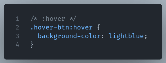
:hover– Styles an element when the mouse is over it.
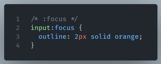
:focus– Activates when an element is focused (e.g., clicking into a form field).
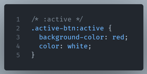
:active– This pseudo-class lets you target an elment’s active state.
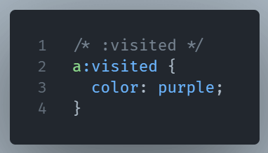
:visited– It lets you style a previously visited link.
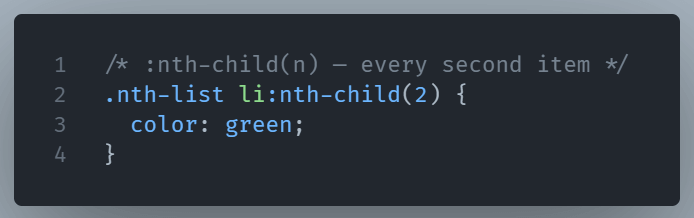
:nth-child(n)– Targets specific items in a list or grid based on order.
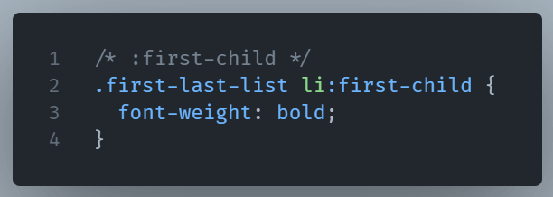
:first-child– It selects the element if it’s the first child of its parent.
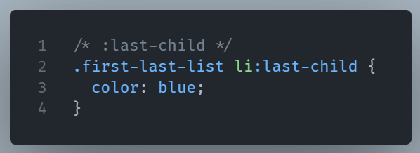
:last-child: This pseudo-class represents the last element among a group of sibling elements.
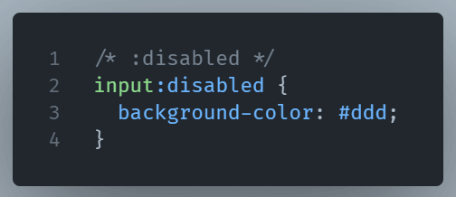
:disabled– Styles Form elements which are not interactive.
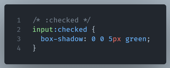
:checked– This selector represents any input or option that is checked.
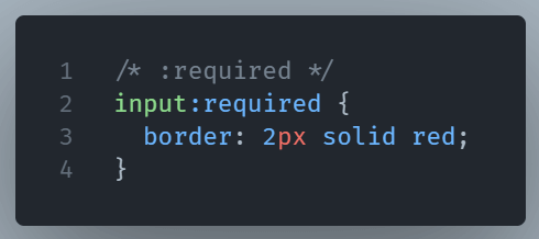
:required– It selects and style form elements with a “required” attribute.
For a complete list of pseudo-classes you can check the MDN website.
Why They’re Powerful
Without pseudo-classes, you’d need JavaScript to detect many of these conditions. With them, CSS can do it instantly and efficiently. They’re also chainable. You can combine them for very specific styling.
When to Use Them
Use pseudo-classes when you want styles to respond to changes without manually adding any JavaScript.
In short, pseudo-classes are CSS’s built-in event listeners, ideal for dynamic designs.