Images have the potential to either help or hurt a design. When handled well, they set the mood and guide attention, but when handled poorly they slow pages down or confuse users.
Beginner designers often just drag in a high-resolution photo and consider the work complete. But thoughtful image use takes more than just uploading a pretty image.
Best Practices for Working with Images in Your Designs
Let’s examine what has proven to be effective.
Choose the Right Format
Start by picking the right image format. There’s no single solution for everyone:
JPG (or JPEG): This format is best for photos and images with gradients.
PNG: Great for images that require transparent backgrounds and lossless compression. like logos or icons.
SVG: Perfect for scalable graphics like icons, logos, and illustrations. It preserves quality, with no pixelation.
WebP: This is a newer format. It requires smaller files and provides better quality. It is widely supported now, and ideal for modern websites.
The takeaway: Use WebP for visuals, PNGs for graphics, and SVGs for shapes.
Compress Without Compromising
Big image files can make your site slow.
But maintaining quality with an image that is not cropped and/or blury is also important. Tools like TinyPNG, ImageOptim, or Squoosh let you shrink images without making them look terrible. Your goal is fast loading and visual clarity.
Mind Image Dimensions
Don’t upload a 4000-pixel-wide image for a space that only needs 600px. Resize your images before uploading. Extra pixels won’t be seen by many users, and your server won’t be happy about them.
Responsive design also matters. Use srcset or CSS techniques to load different sizes for different screens. That way, a mobile browser doesn’t get stuck loading a desktop-sized image.
What Is srcset (and Why Use It)?
The srcset attribute allows you to serve different image sizes depending on the user’s screen resolution or device width.
Here’s a basic example:
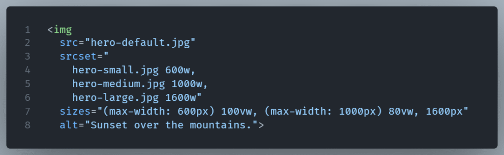
What’s going on here?
srcsetdefines the available versions of the image and their widths (wstands for pixels).sizestells the browser how much space (in viewport width or pixels) the image will occupy in different layouts.- The browser picks the best version of the image based on the device and display size before downloading anything.
This is great for: Hero images, large content banners and generaly images where quality matters on biggers screens.
Always Use Alt Text
Alt attribute is not just for accessibility, although that’s a great reason to use it alone. Search engines use alt text to comprehend images. It also shows up if the image fails to load, giving your users something instead of nothing.
Be Consistent
Consistent is often overlooked. Keep a consistent style regarding tone,and light. If some images are dark and blunt while others are bright and playful, the design starts to feel disconnected.
Final Thought
Images are powerful but they need to be handled carefully. Follow the correct format and the right compression, use a reasonable size, and be consistent. These small habits improve both the look and function of your site.