Web developers often hear phrases like “negative space”, “above the fold”, or “visual hierarchy”. Design has its own language, and while it might sound abstract at first, learning a few key terms can make collaboration with web designers easier, faster, and way less uncomfortable.
Let’s See Some Common Design Terms to Help You Communicate with Designers
Visual Hierarchy: What Grabs Your Attention First
Visual hierarchy refers to order and emphasis. Designers use size, contrast, color, and spacing to show users what to look at first, second, and so on. A giant headline or a muted button are examples of visual hierarchy.
Understanding hierarchy, your code won’t unintentionally mess with web designers’ intentions.
Let’s see a design scenario:
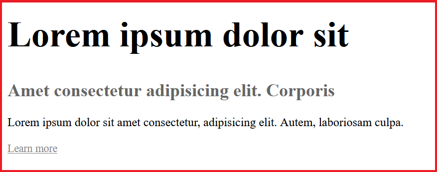
We created a landing page that has, a big, bold headline at the top. A medium-sized subheading below it, and a small “Learn more” link tucked underneath.
How it works:
This hierarchy directs the user’s attention in order: headline → subheading → link.
Tip: If you styled the “Learn more” link to be the same size and color as the headline, you’d have broken the hierarchy.
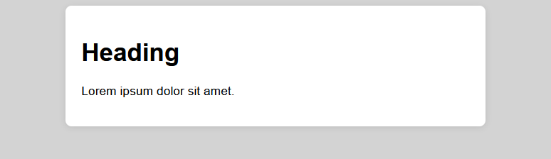
White Space (a.k.a. Negative Space)
White space is not wasted space. In web design is considered breathing room. White space is the empty area around or between design elements. It helps content feel organized, not crammed. As a developer, respecting margins and padding decisions supports the overall design rhythm.
Design Scenario:
We created a card component that has extra padding between its title, description, and social icons. This way it feels open and easy to read.
Cramming everything tight together makes it feel cluttered and harder to scan.
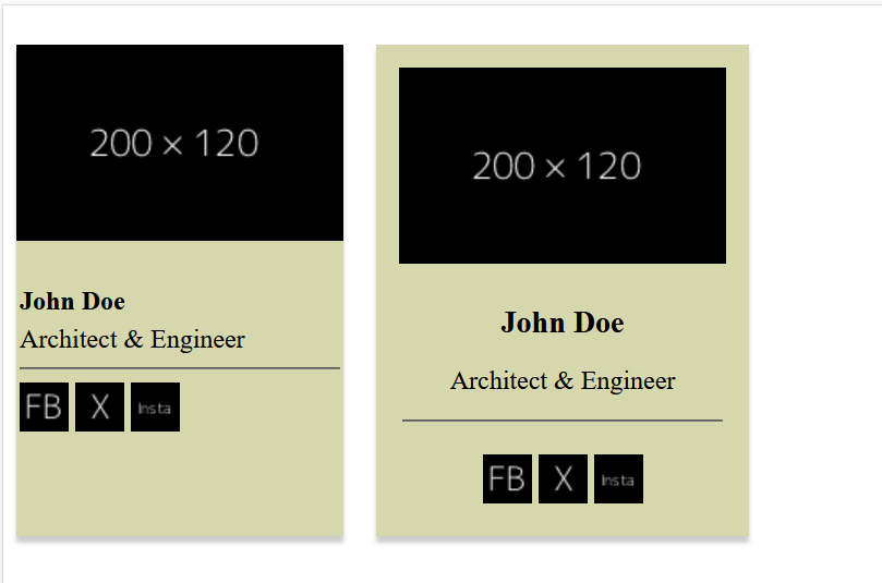
Tip: Here the developer should avoid removingpaddingormarginjust to “fit more in.” That white space is intentional.
Above the Fold
This is a term borrowed from newspapers.
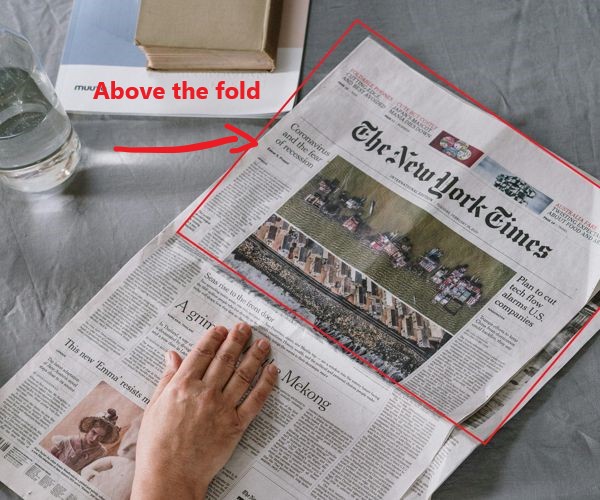
On the web, it refers to the part of a page visible before scrolling. Designers often prioritize placing key messages or CTAs above the fold. When building layouts, keep this in mind, especially for hero sections or landing pages.
Design Case:
The verygoodcopy.com website places a hero section with a headline, call-to-action (“Join some 80K email subscribers“), the email input, and no supporting image in order to make visitors subscribe to their email list.
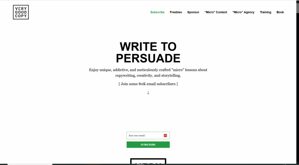
This top section needs to communicate value fast, since not everyone scrolls immediately.
Dev tip: Developer should avoid pushing the CTA below the fold by adding unnecessary vertical spacing or large images.
Contrast
Contrast helps text stand out.
Design Scenario:
A light grey background holds a white text box with black text inside. Text pops, layout looks clean. High contrast improves readability.
Dev tip: Use color contrast tools if in doubt.
Alignment
Alignment makes everything organized and purposeful. Elements that are off by just a few pixels can appear misaligned.
Design Scenario:
Create a card with title, subheading, and description. Alignment ensures things feel balanced—even subtle misalignment can look “off.”
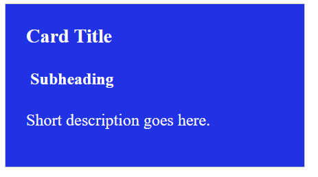
Dev tip: Always match padding, margin, or grid alignment to the design spec.
Responsive and Breakpoints
“Responsive” means the design adapts across devices. “Breakpoints” are the specific widths where the layout changes. These terms matter when translating a mockup into real code, especially with flexbox, grids, and media queries.
Design Scenario:
On desktop, a three-column layout is used. On tablets, it switches to two. On mobile, it becomes one column.
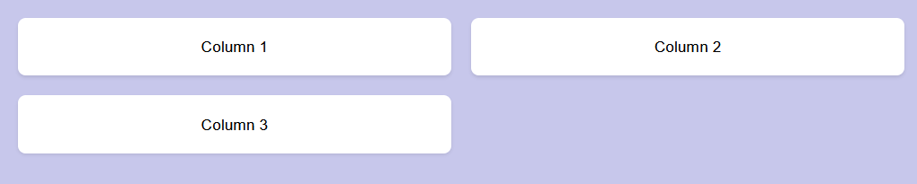
Designers use “breakpoints” like 768px or 1024px to define where these changes happen.
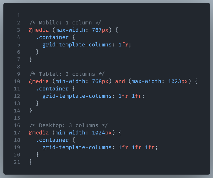
Dev tip: Match your CSS media queries to the breakpoints in the design system or Figma file.
Conclusion
Understanding a designer lets you code in a way that respects their intent.
These terms are more than just design jargon; they’re an easy way to improve the user’s experience on the page.