Great design isn’t just about color palettes or typography. It’s also about spacing.
Mastering empty space is key to successful web design.
While we see color and typogrphy, spacing is something we sence rather than something we see.
Sometimes we visit a website and it feels cramped.
It is like the paragraphs, and images are competing with each other for space.
That’s the result of neglecting spacing.
Without it content seems to aggressively demand attention. And aggressive content is difficult to understand.
What does spacing actually mean in web design?
Think of it like the personal space between elements.
Headlines, paragraphs, buttons, and images, just like people, need space to breathe and feel comfortable.
Spacing appears in four key forms:
- Margin: the space outside an element
- Padding: the space inside an element
- Line-height: the vertical gap between lines of text
- Letter-spacing: the distance between characters
Each one plays its part in giving to a website’s layout breathing room.
The importance of spacing is often underestimated. Here’s why:
Good spacing doesn’t just make a website “look nice.”
It makes it friendlier to a visitor. It makes it easier to scan, easier to read, and easier to navigate.
That’s hugely important, considering most users quickly scan and assess websites.
It also builds visual hierarchy—meaning it highlights what matters most.
Spacing helps direct the reader’s eye from headline to subtext to call-to-action without any need for arrows or flashing buttons.
Seedlipdrinks website is a great example showing how white space can make important content stand out.

Seedlip’s clear and concise messaging is effectively communicated through whitespace and a single line of text.
What’s the ideal amount of space, though?
There’s no magic number, but starting with a spacing scale, like increments of 4px or 8px, helps keep things consistent.
Consistency makes everything feel like it belongs together.
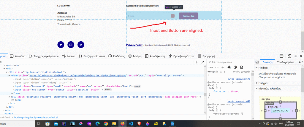
How to achieve consistency?
Browser dev tools offer significant help.
Or we can use design frameworks like Tailwind CSS, and Milligram.io, that integrate spacing right into the workflow.
Conclusion
White space is vital; allows brain to reset. It is not wasted space.
Proper use of white space leads to clear content, balanced layouts, and increased visitor engagement.
Sometimes, what we don’t put on a webpage matters just the same as what we do.