The HTML input element is one of the most commonly used elements in web forms. It allows users to enter data, which can then be processed by a web server.
Basic Syntax
The basic syntax contains a type attribute, a name attribute (identifying the input field upon form submission), and a value attribute (storing user input or default input).
Different Input Types
Different HTML input types allow for the collection of specific data, including text, passwords, dates, and colors.
For example, specifying “password” as the input type signals to the browser that the input field is for sensitive information, hiding characters, disabling copy-paste, and possibly prompting password managers.

We need to understand each input type’s unique purpose in designing useful and user-friendly forms.
In the absence of a type attribute, it defaults to text.
Here are the available input types:
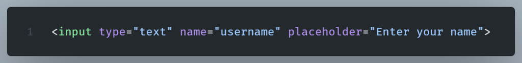
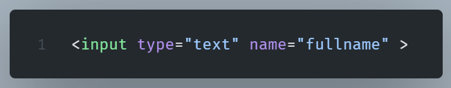
Text Input
The text input type lets users enter any character combination. Names, addresses, and other text are common uses for it.
Password Input
The password input type is for password fields that hide the user’s input. This offers fundamental privacy and security for sensitive data, such as passwords.
Example:

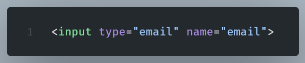
Email Input
Email input types help users enter correctly formatted email addresses through built-in validation.
Example:
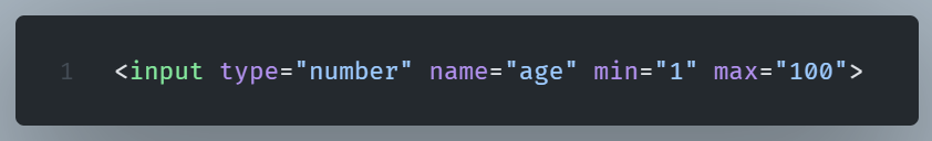
Number Input
Number input fields are specifically for entering numbers.
It offers an easy method for number input, frequently including up/down arrows for value modification.
This input type is optimal for quantities, prices, and other numerical data.
Example:
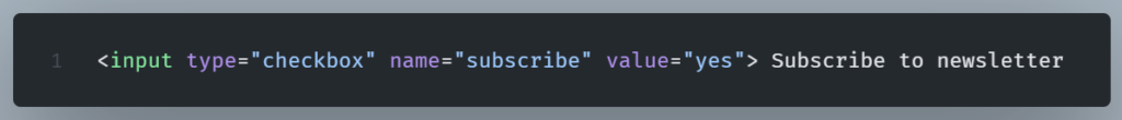
Checkbox Input
Checkboxes let users select multiple choices from a group of options.
Checkboxes are independent; selecting one doesn’t change the others. That makes it perfect for choices like interests or form features.
Example:
(click on the image to open in a new tab)
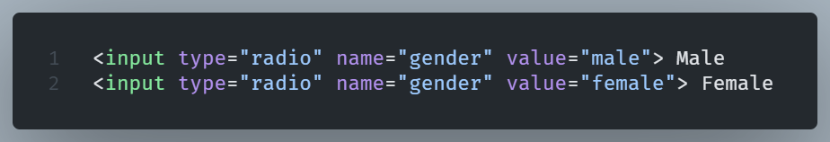
Radio Input
Radio buttons let users pick just one choice from a set of options. Only one radio button can be selected at a time.
Choosing an option will automatically unselect any other option in that group.
Example:
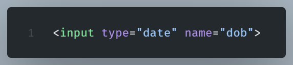
Date Picker Input
The file input type lets users select files from their device for server upload or JavaScript processing. Uploading documents, photos, and other files needs this input type.
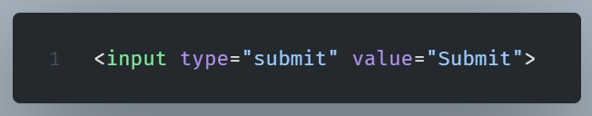
Submit Input
This input type sends the form data to the server for processing or uses JavaScript to process it.
Example:
Common Input Attributes
It’s the input element’s attributes that make it powerful.
We have already seen the type attribute which defines the type of input.
Examples include text, password, email, number, checkbox, etc.
Let’s present a list of all the input attributes with a brief description.
- name – The name attribute is crucial for successful form submission. Every input needs a unique name attribute for accurate data labeling and retrieval.
- value – The value attribute specifies the default value of the input field. It’s the data that will be sent along with the form if the user does not change it.
- placeholder – The placeholder attribute is used to provide a hint or instruction within the input field that guides the user on what to enter. When a user begins typing, the placeholder text disappears.
- required – The required attribute indicates that an input field must be completed before the form can be submitted.
- disabled – The disabled attribute disables the input, preventing user interaction.
- readonly – The readonly attribute makes the field read-only (user can read but not edit).
- maxlength – The maxlength attribute limits the number of characters allowed.
- autofocus – The autofocus attribute automatically focuses on the input when the page loads.
- autocomplete – The autocomplete attribute determines whether an input field supports. If it does so, the browser uses past user entries to predict values.
- pattern – The pattern attribute provides a regular expression against which the input value is checked.