We have already discussed how to place items cleanly and efficiently on a web page using CSS Grid. CSS Grid automatically creates lines, columns, and rows, that we call tracks. A track gap is the space between two neighboring grid lines.

Set row and column gaps separately
There are cases where rows need more space than columns, or the other way around. You can control them separately with the row-gap and column-gap properties.
Look at the example below:
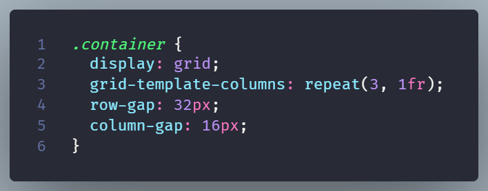
In this example, rows have 32px between them, while columns have 16px. This can help in the case of cards containing different amounts of text but need more room to breathe.
The shorthand form
The shorthand form can accept two values.
The first value controls the row gap and the second controls the column gap.
For the gap shorthand property, you can use values such as percentages, pixels, em, and calc(). However, you cannot use fr units in this case.
How is gap different from margin?
You can create space with margins, but gap is easier to manage in CSS Grid. Margins belong to individual items, so the first or last item may need special rules. On the other hand, gap belongs to the CSS Grid container and applies the same spacing between each track.
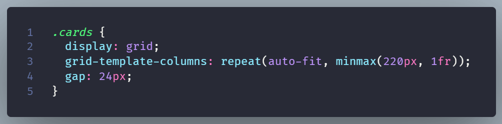
Remember that gap controls space inside the Grid.
It won’t help if you want to create space between the Grid’s content and its outer edge.
In that case just use padding.
Here is a simple example using both padding and gap:
The padding: 16px creates space around the inside edge of .cards. The first card does not touch the gray container.
The gap: 24px creates space between the cards. It applies to both the columns and the rows.
Conclusion
With the row-gap, column-gap, and gap properties, you have flexible tools to manage the spacing between elements in a CSS Grid layout.
These properties let you design grids that are not only visually appealing but also have consistent, adjustable gaps between rows and columns.