The feel and look of text are both important.
Sometimes we look at a webpage and although the colors are great, the fonts much, and images are unique we feel that something is off.
Why is that? Probably, it’s how it’s spaced.
That’s where line-height and letter-spacing can make all the difference.
Line-height: Vertical spacing that’s easy on the eyes.
Let’s start with line-height.
Proper line-height is like giving your text room to breathe.
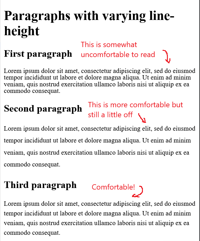
Insufficient spacing between lines makes your paragraph look like a solid block of text. We usually scroll past and overlook it completely.
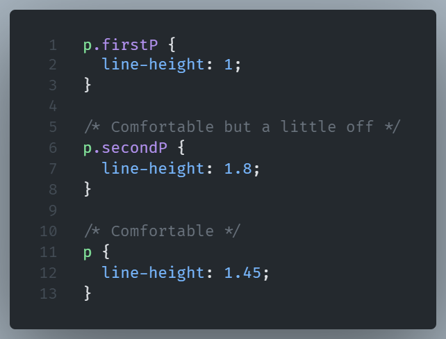
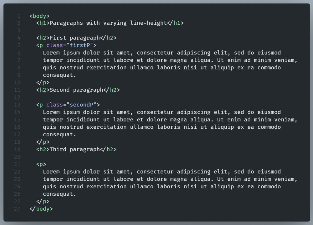
Here’s a simple comparison:
The CSS:
The HTML:
Result:
NOTE - It's more flexible, and responsive to use unitless values (1.5, not 24px).

That way, if your font size changes, the spacing scales along with it.
Letter-spacing: Give your text room to breathe.
While line-height handles vertical space, letter-spacing deals with the horizontal space.
It controls the spacing of text, especially in headlines and all-caps.
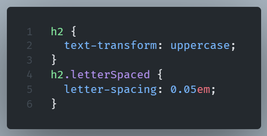
Result:
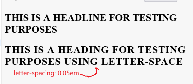
This slight change improves the visual appeal while softening the impact of bold headings.
NOTE: Use that feature carefully; overuse makes a page look weird.
Negative values are also permitted.
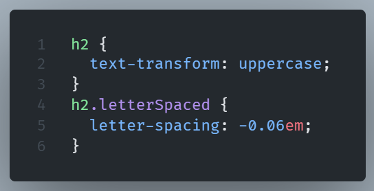
Result:

But don’t overdo it. Letters that bump into each other create unreadable text.
Spacing is design
When design comes to mind, we tend to think about color combinations and shades and sophisticated fonts.
It is Fonts and Colors who get all the credit.
But what about spacing? Spacing quietly does the heavy lifting.
You might not think line-height and letter-spacing are important but get them wrong, and even the best design with great colors and fonts might feel off.
So play with them, find the right balance, and trust your eyes.