There are some tools on the web that make checking thecolor contrast of a website very easy.
These tools follow the Web Content Accessibility Guidelines.
Web Content Accessibility Guidelines or (WCAG) 2.0 are a set of recommendations for creating accessible websites.
These guidelines help make content accessible to more people with disabilities, among others, for people with color vision problems.
The aforementioned tools measure foreground and background color contrast for WCAG 2 AA and AAA compliance.
For normal text, WCAG 2.0 level AA requires a minimum contrast ratio of 4.5:1; large text needs 3:1.
On the other hand, the more strict level AAA demands a contrast ratio of at least 7:1 for normal text and 4.5:1 for large text.
Websites to check color contrast
There are websites that contain free color contrast checkers.
These websites sell services to ensure digital accessibility compliance.
They usually offer a color contrast checker as a free tool, that enhance the relationship between the service and the prospects and at the same time enhances SEO efforts.
Let’s check out some of them.
WebAIM Contrast Checker
WebAIM Contrast Checker is a simple tool to test color contrast ratios.
Let’s use it to examine some color pairings.
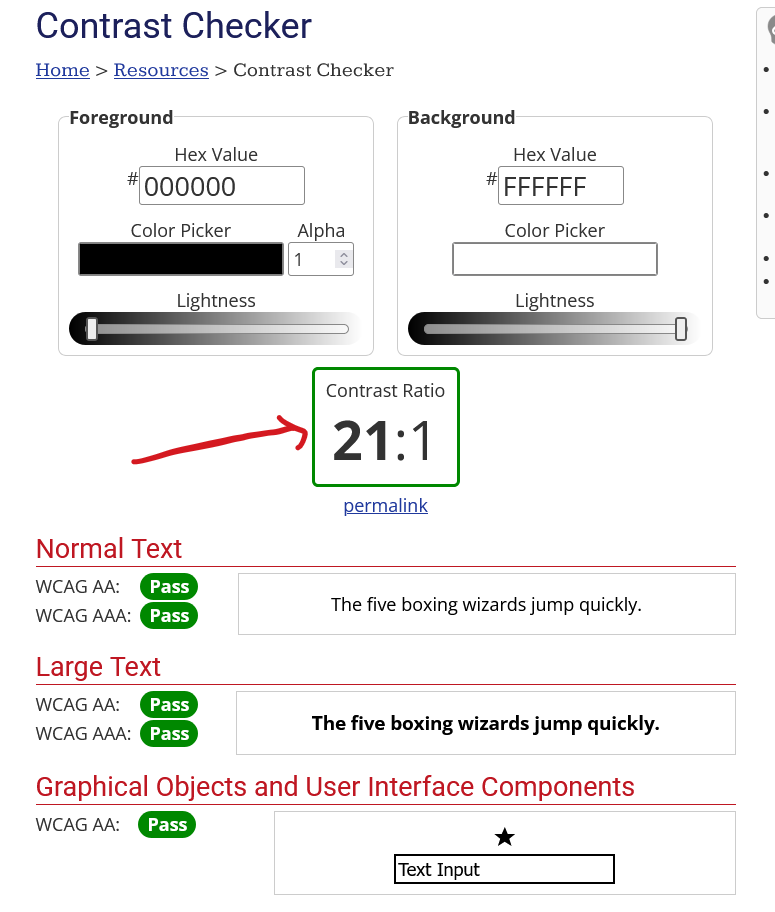
Testing black contrast again white, the result is optimal.
Twenty on to one is the highest ratio a color contrast can achieve.
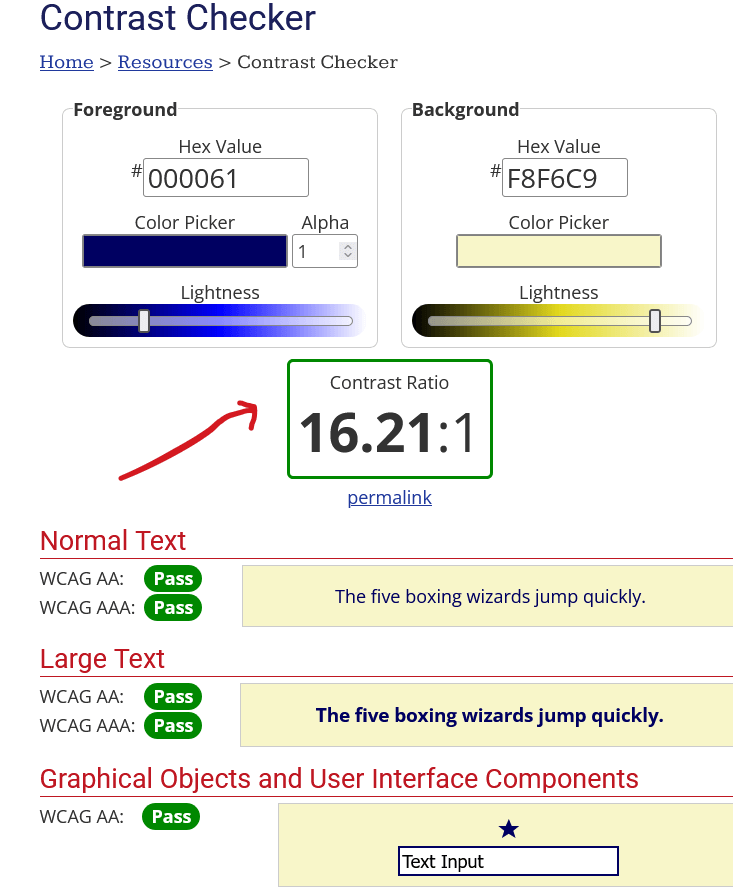
Testing blue against beige is still great.
It may be quite lower than the optimal score, but still a lot higher than the base level of contrast ratio of 7:1 for normal text and 4.5:1 for large text.
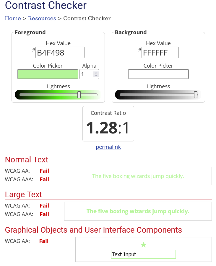
The last test has failed miserably in every regard.
The 1.28 ratio is too low contrast even for people with perfect vision.
Userway.org Constant Checker
This is another service provider that helps websites become more accessible.
It also has a free color constant checker.

Coolors.co contrast checker
This tool is dedicated to colors. Creating palettes, extracting colors, etc.
It doesn’t audit accessibility compliance apart from color contrast.
It utilizes a great tool regarding UI and UX. It is beautiful and simple, which is always a good thing.
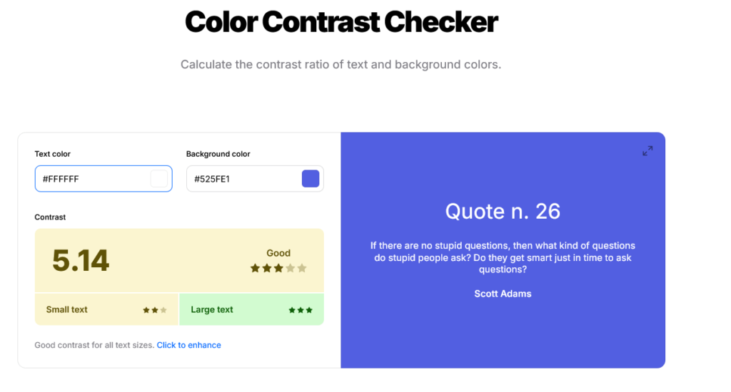
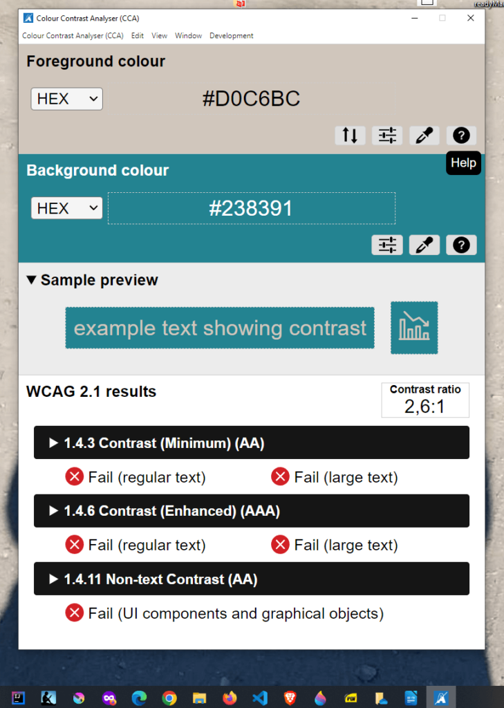
Color Contrast Analyzer (CCA)
This is a desktop app for thorough testing.
It is created from TPGi and is good for both Windows and Mac. We can download it free from TPGi website.
This app not only tests contrast ratio, but it also includes a Color Blindness Simulator that checks color contrast across different vision deficiency settings.
In the above example we check color contrast of two colors.
The tool displays the WCAG 2.1 results and a sample preview.
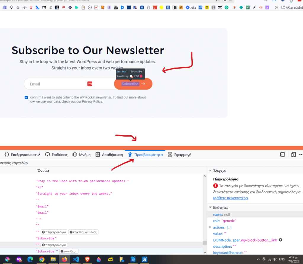
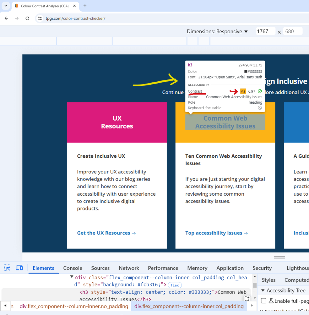
DevTools in Browsers
Chrome and Firefox have built-in tools to inspect color contrast directly in the browser.
In Chrome, we open DevTools by pressing F12.
Hovering over an element will show as the color contrast rate and the accessibility level of that element
Below is an example of how Chrome DevTools provide information about a heading.
Firefox has a similar tool.
We open with F12, then we select the Accessibility tab.
Now hovering over an element will give us information about how accessible this element is.