When you build a website, every element you place—whether it’s a heading, an image, or a button—is treated like a box. In CSS, this concept is called the box model, and it’s the foundation for how browsers calculate spacing, sizing, and layout.
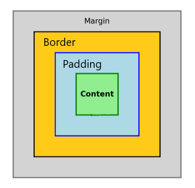
At its core, the box model breaks each element into four layers, stacked outward:
- Content – the actual text, image, or child elements inside.
- Padding – the space between the content and the border; think of it as breathing room.
- Border – a line wrapping around the padding and content.
- Margin – the outer layer, pushing the element away from its neighbors.
Here’s a simplified CSS Box Model diagram with each box neatly nested inside the other:
- The Margin wraps everything.
- Inside that, the Border.
- Then comes the Padding.
- At the very center, the Content.
It looks simple, but the devil is in the details. For instance, if you set an element’s width to 200px, that’s only the content box by default. Add 20px of padding and a 2px border, and suddenly your element isn’t 200px wide anymore—it’s 244px. This explains why layouts can break unexpectedly.
So why does this matter? Almost everything you do with spacing—centering a card, creating gutters between columns, aligning buttons—relies on the box model. Once you get it, you’ll start thinking in boxes, and design choices will feel less like trial and error.
How border-box can help
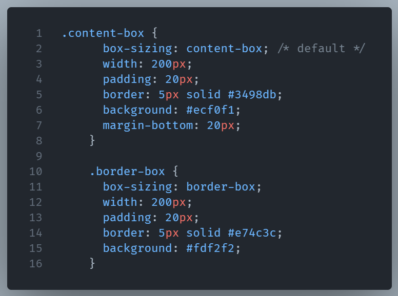
You can change how browsers interpret width and height using the box-sizing property. Set it to border-box, and the declared width will include padding and borders, which often makes layout math simpler.
By default, CSS uses box-sizing: content-box;. That means when you set width: 200px;, the 200px applies only to the content. Padding and borders are added on top, making the element larger than you may expect.
With box-sizing: border-box;, the declared width includes the padding and border. The box never grows beyond the size you set—it’s much easier to control.
Here’s a simple example:
Below we can see a visual diagram showing the difference between content-box and border-box side by side.
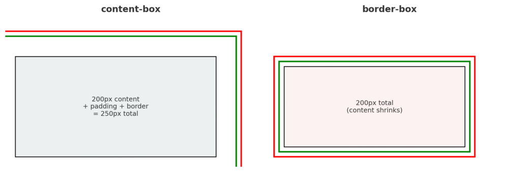
- content-box (default): width applies only to the content. Padding and border add extra size, so the box grows larger than the declared width.
- border-box: width includes content, padding, and border. The total size stays fixed, and the content area shrinks to fit.
This is why many developers set * { box-sizing: border-box; } globally—it makes layouts more predictable.
Concluding
In practice, the box model is both rigid and flexible. Rigid, because the rules don’t change. Flexible, because once you know the rules, you can bend them to create any structure you need.
Comprehending how the box model impacts an element’s size is key to web development.