We use the term color contrast to describe the difference in luminance or color that makes text easily visible against its background.
When this difference is big, the color contrast is high.
Users with visual impairments can read text and navigate content with high contrast more easily.
Low contrast text, on the other hand, can make the life of a person with Color Vision Deficiency difficult.
And this deficiency is not as rare as many developers think.
The facts speak for themselves.
One in twelve men is color blind. Things are better for women (1 in 200).
With 90% of color-blind people reporting that it affects them at work, and 75% needing help from others to verifying colors, this is not something to take lightly.
Web developers must ensure that content on their website is of high contrast.
What is high contrast content?
Below is an example of sufficient contrast.
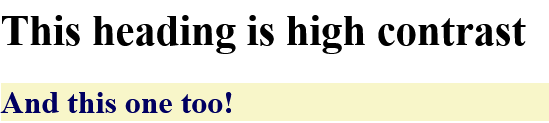
A typical example of high contrast colors that include pairings like black and white, or blue and beige.
The first heading is black text (#000000) on a white background (#FFFFFF) (21:1 contrast ratio).
And then a second heading (h2) with dark blue text (#000061) on a light yellow background (#F8F6C9).
Designing with Good Color Contrast
People visit our websites to get answers to their questions or to get help with an issue they have or a task they want to fulfill.
They come for the content.
So making this content accessible to the greatest number of people that can benefit from is the reason for building a website in the first place.
Web developers can consider some useful tips regarding color contrast when building a website.
- Use high contrast between text and background
- Don’t depend only on color to convey meaning
- Consider Different Screen and Lighting Conditions
- Use Readable Font Sizes and Weight
Let’s check them in detail.
Use High Contrast Between Text and Background
Higher contrast improves readability, especially in bright or dull lighting.
There are well defined requirements regarding what is considered accessible in text.
These requirements are called ‘Web Content Accessibility Guidelines’ or for short WCAG 2.1.
According to these guidelines, content can be classified into one of three categories:
– A – Means content is NOT accessible
– AA – Means content is accessible to most people with disabilities. This is the minimum requirement.
– AAA – This is the higher grade. Content at this level is accessible to almost anyone.
Although content in AA is considered user friendly, we want the highest grade (AAA).
There are some tools that can check color contrast between foreground and background color
Below is an example of bad color contrast:

Light gray text (#CCCCCC) on a white background (#FFFFFF) (1.6:1 contrast ratio—fails WCAG).
Don’t depend only on color to convey meaning
Convey information using also text labels and icons.
For example, error messages with icons instead of just red text.
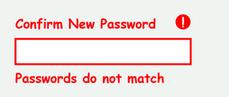
Below is a required input field that communicates the error with color and text.

The below example shows a combination of color, bold text, and an icon for communicating an error.
Consider Different Screen and Lighting Conditions
Users may be in bright sunlight, using night mode, or have low-quality screens.
Checking how our screens look in different lighting conditions should be on our to do list.
For example, when reading in poor light environments, a dark mode can make it easier for the eyes.
We should strive not only giving a choice for a different mode but ensuring that this mode has a sufficient contrast.
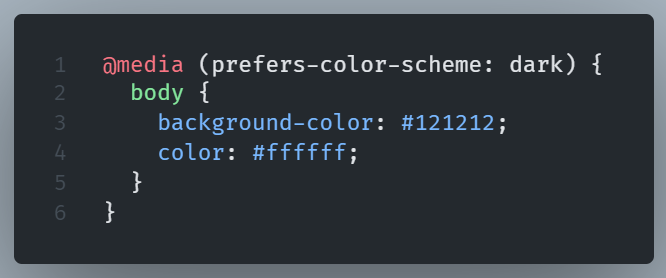
Dark mode designs are bettrer off not using pure black but a softer dark gray like #121212
Use Readable Font Sizes and Weight
Small or thin fonts can make reading difficult, even if the color contrast is high.
A font size of at least 16px, or even better 18px, for body text makes reading easier for all, not only for people with visual impairments.
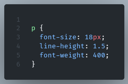
We should prefer bold font-weight when there is a need to emphasize a word and use appropriate line-height and letter-spacing.
The above text got a warning from accessibility checkers. Links are too thin.
Look how better is with bold links instead.