Background images are an effective tool in web design. They can set the mood, reinforce branding, or add depth. But if they don’t scale properly, they can break layouts, especially on mobile screens.
Fortunately, CSS gives you the tools to make background images both flexible and reliable.
CSS Techniques for Background Images That Scale
Let’s go through the essentials.
Use background-size: cover for Full Bleed
One of the most common and effective techniques is:
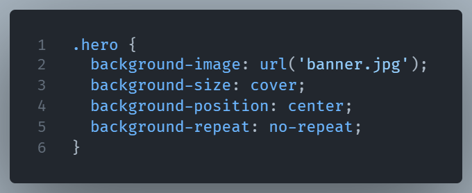
Here’s what happens:
covermakes the image fill the container entirely, even if it crops.centerensures the focal point stays in view.no-repeatprevents any accidental tiling.
This is perfect for full-width hero sections or large banners that need to stay striking and smooth across devices.
Use contain When Cropping Is a Problem
Sometimes you don’t want the image cropped but you want the whole image to fit.
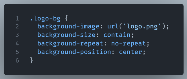
This makes sure the full image is visible inside the box, even if it doesn’t cover the entire area. It’s great for graphics, product images, or any element where full visibility matters.
Keep It Responsive with Media Queries
If your image needs to change with screen size, media queries are your friend:
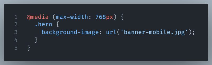
This lets you serve a smaller, more appropriate version to phones or tablets keeping your site faster and your layout cleaner.
Final Thought
Whether you’re building a landing page or styling a simple card, using cover, contain, and media queries can help your designs stay sharp, fast, and fluid on every screen.