Unlike print media, the internet is a dynamic medium.
Page components are not static. They can bounce or rotate. Menus can drop down. Colors can change values.
Our brains notice changes in things by observing how these changes move from one state to the other.
And this movement is happening gradually.
Similarly, changes in the web should also follow a pattern of gradual movement.
The best way to achieve this is with CSS transitions.
With transitions, we can control animations’ duration and speed. We can make property changes occurring smoothly and gradually over a certain period, making pages interactive and improving user experience.
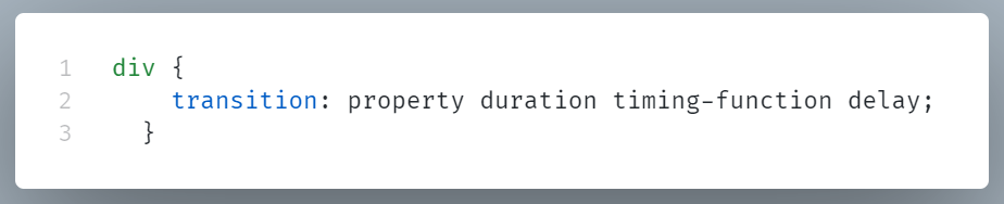
The following is the CSS syntax for transitions:
Let’s see these transition properties one by one.
property: The CSS property to apply the transition to (e.g., height, margin).
duration: The time needed for the transition to be fully executed (e.g., 0.4s, 300ms).
timing-function: The transition’s speed curve options (e.g., jump-start, linear, ease-in…)
delay: The amount of time to delay before beginning the transition (e.g., 0s, .5s).
Example:
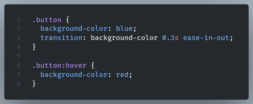
Here, when the user hovers over the .button element, the background color smoothly changes from blue to red over a duration of 0.3 seconds.
Understanding Transition Properties
Transitions use the transition-* family of properties.
By using the sub-properties below, we can manipulate each component of the transition.
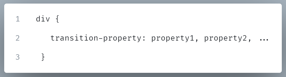
transition-property
The transition-property indicates which properties to transition.
Syntax:
_property1, property2,…_: Specify the CSS properties that the transition should be applied to.
As we see in the example, we can list more than one properties by using commas.
Common Use-cases
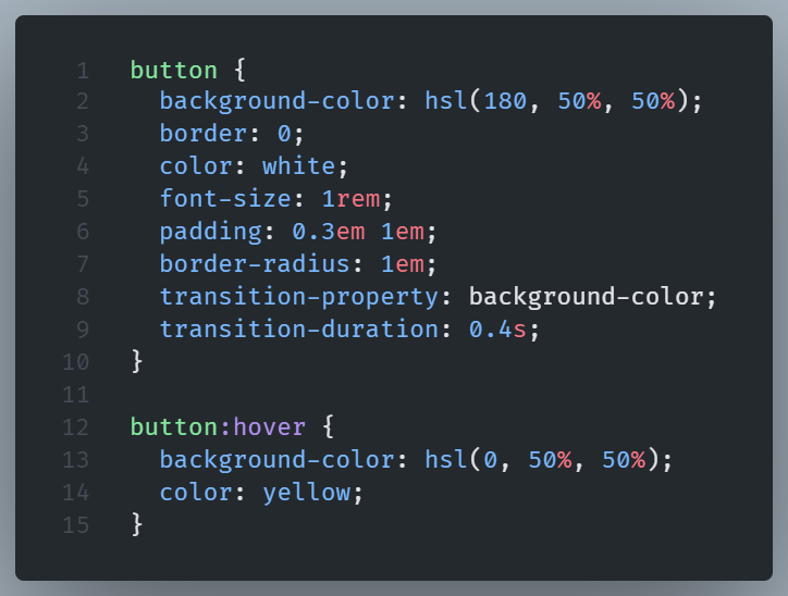
1. Single Property Transition:
Transition will be applied only to background-color property for a period of .4 second when it changes.
2. Multiple Properties Transition:
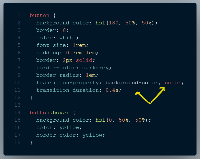
Here, both color and background-color properties will transition for .4s.
3. All Properties Transition:
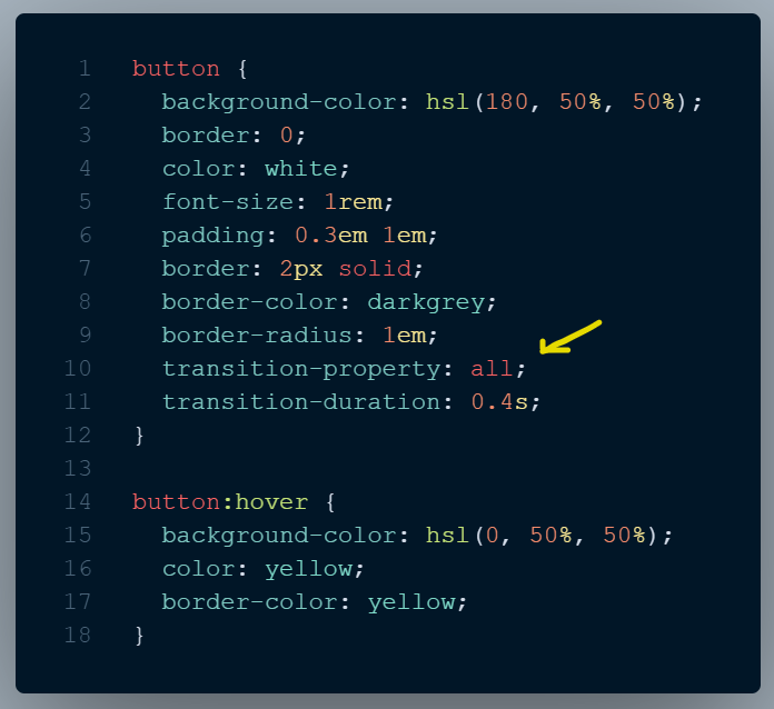
In this case, the special keyword all, which is the default transition-property value, will transition any properties that change (in our case: background-color, color, border-color).
transition-duration
The transition-duration sub-property, determines how long a transition animation lasts.
The default value is set to 0s, indicating that there will be no animation.
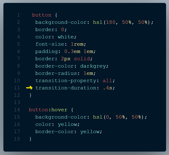
In the example, the transition-duration property indicates that the transition will last for 400 milliseconds.
Adjusting the speed of transitions helps users to better comprehend UI changes.
Transition-duration is not a one size fits all metric.
A slower animation (600ms) will feel boring to most users when it is repeated multiple times, such as in a contextual menu. Most people will notice micro-animations of around 250ms, without feeling like they’re waiting too long for them.
On the other hand, for an element that doesn’t require immediate attention, a lengthy transition, like a bounce, would be fine.
transition-delay
With transition-delay, we can define a waiting period before the transition starts after the property value changes.
When a link has a transition delay of 0.5 s, the change won’t start until half a second after the mouse hovers over it.
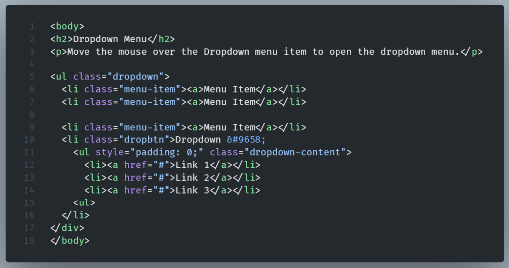
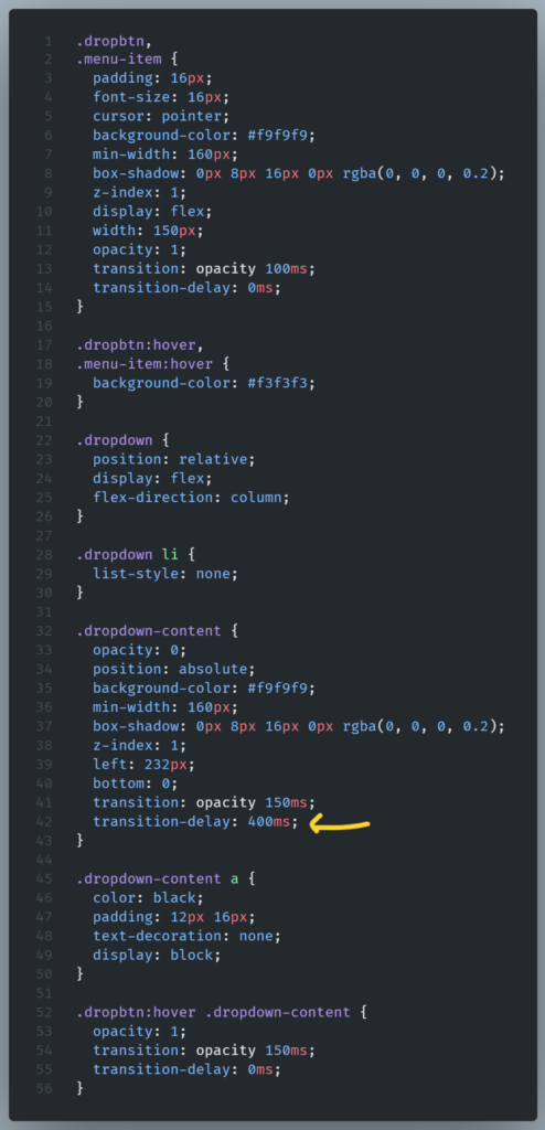
A practical example of how transition-delay works is in the case of a dropdown menu.
The dropdown will only stay open if we keep hovering over it. If we move the mouse diagonally to select a child, the menu will close due to our cursor being off limits. This is a headache. Let’s try to remedy it with the help of transition-delay:
HTML
CSS:
See the Pen transition-delay by Lambros (@lampxatzi) on CodePen.
In the example, we manage to fix this by delaying the transition.
If the user moves their mouse outside of .dropbtn, nothing happens for 400ms.
If the mouse goes back into the element within that 400ms time-frame, the transition is canceled.
Once 400ms pass, the transition starts as expected.
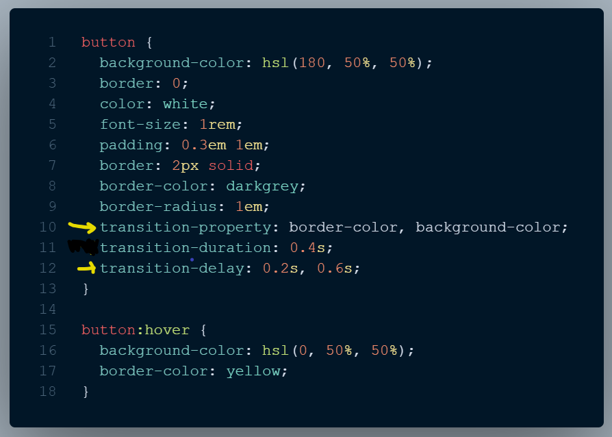
Transitioning two or more properties
If we want to apply two different transitions to two different properties, add multiple transition rules with commas between them.
When transition-delay is set to a negative time offset, the transition will start immediately but will appear to have started at the specified offset.
The transition will seem to start in the middle of its play cycle.
Here, using transition-duration: .4s; transition-delay: -0.2s will cause the transition to jump .2 seconds into the transition cycle before continuing.
The effect will be animated as if it had already been running for .2 seconds.
Using a negative transition-delay value, achieves a better transition experience by shortening its perceived duration.
transition-timing-function
By using the transition-timing-function CSS property, we can control speed during the transition.
We can affect what kind of transition effect we’d like to achieve by using several keyword values, such as linear, ease-in and ease-out.
A linear transition moves at a steady pace, while ease-in and ease-out, accelerates and decelerates respectively.
These are just a few of the available transition function values.
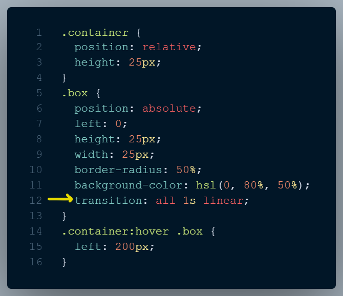
When we run this example, a small red circle appears in the top left corner of the page.
When we hover over the container, the box transitions to the right.
Pay attention to how it moves at a consistent pace.
We can edit to see how different timing functions behave. We can try ease-in (transition: all 1s ease-in) or ease-out (transition: all 1s ease-out).
These predefined keyword values are sufficient for carrying out most tasks, but sometimes we need more control.
We can achieve this by defining our own timing functions.
Cubic Bezier Curves
A Cubic Bezier Curve is a curved line defined by four numbers.
This line defines the easing of a web component’s movement.
We’ve seen that there are available to us predefined Cubic Bezier Curves like ease-in and ease-out, but we can insert our preferred values as well.
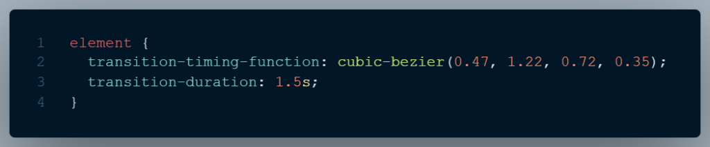
In the example, we use the cubic-bezier keyword with a parenthesis.
In there, we define four points that actually represent the coordinates on a X and Y Axis. We can represent the animation-timing-function value on our previus example, on a X and Y axis graph as follows:
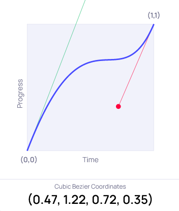
If we add the two properties in our previous example, we notice the red circle start accelerating, then almost stops, and then accelerates again.
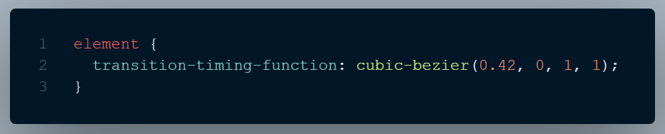
This is our own custom movement. If we’d like to use a predefined one, like ease-in what we would actually used would be a cubic-bezier with predefined coords.
Ease-in is the equivalent of:
The x axis depicts the transition’s duration.
The y-axis represents the rate at which the transition occurs. Curves are defined with the x and y axes spanning from 0 to 1.
The coordinates for the bottom-left corner are 0, 0 and for the top-right is 1, 1.
Best Practices
Transition Duration
In most cases, movement shouldn’t last too long.
Transitions should be quick, but not too short to be missed.
As a rule of thumb, single transitions work best within the 150–500 millisecond range (0.15 to 0.5 seconds).
Keep in mind that the duration of the transition as defined in the code, is less important compared to how the transition feels from the prespective of the end user.
The start of a transition with a very slow ease-in may not be noticeable right away, although technically transition delay may be set to nil.
Movement affects UX
Movement is essential for creating the desired feel and branding of your website or web app.
For example, in the case of something important that should be known about immediately, speed and obviousness would be a priority.
If the situation is extremely crucial, we can use a stronger physical gesture, like shaking, in order to communicate how important the thing is.
So it is best practice to always question whether the movement communicates the desired feeling effectively.
Make UI components more natural
In the real world, it’s very rare for any type of movement to immediately accelerate or come to a sudden halt.
When an animation appears odd, it’s probably because it starts or finishes suddenly, without a natural flow.
It’s considered best practice to include a touch of easing in and out to our cubic-bezier curves, even if it’s subtle. This slight easing can make the difference in achieving a smooth transition.
Let’s see an example:
CSS:
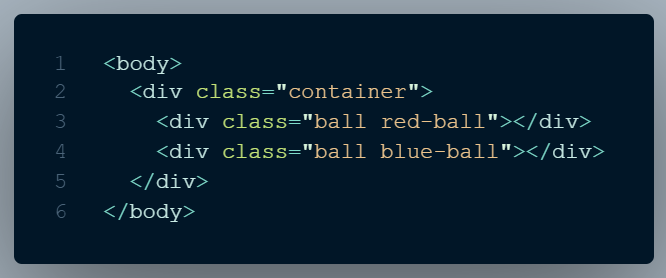
HTML:
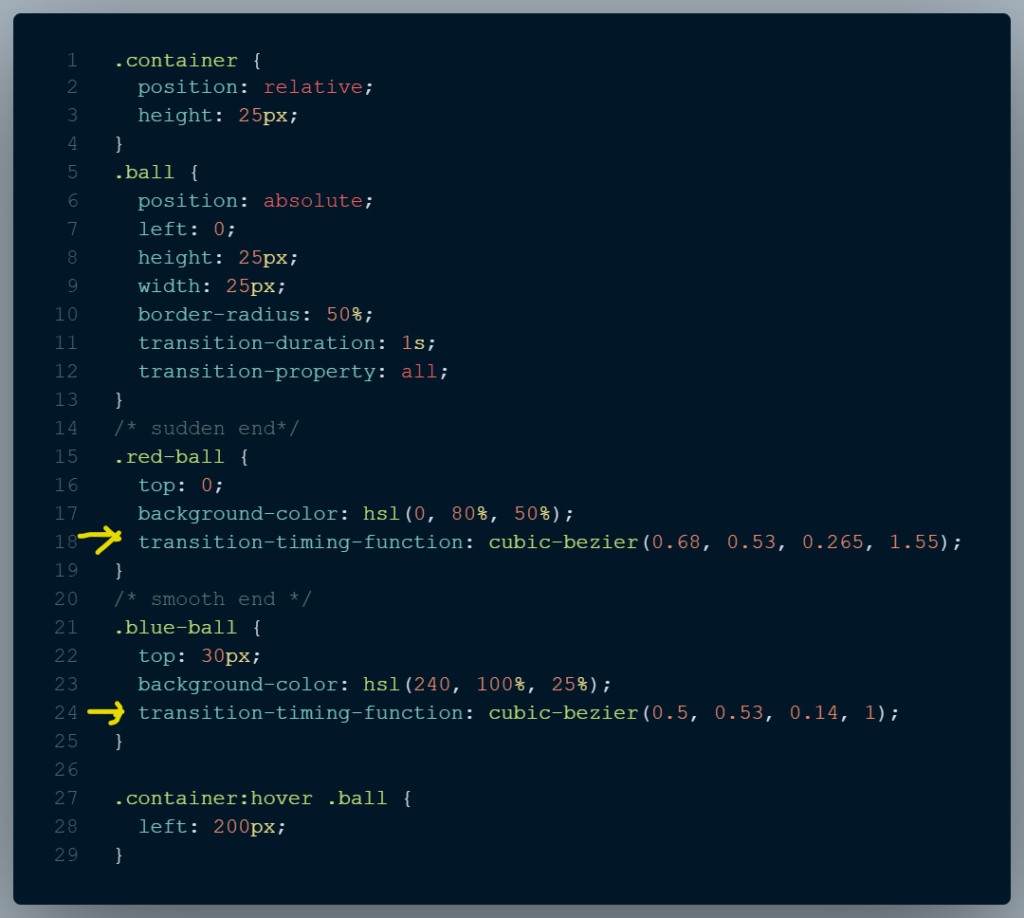
When we hover over the two circles, they start move.
We notice that the first circle (red) ends abruptly, which is not ideal.
The custom curve of the first one (blue) provides a smoother ease in and out.
Regarding Transitions, it’s usually best to be modest rather than exaggerated
Excessive movement can often make things look worst rather than better.
HTML:
CSS:

In the example, the transition in the red box lasts a few milliseconds more than it should be adequate. The scaling on the hover feels weird.
Compare with the blue box where the transition last just .15s and feels more natural.
Excessive action can be worse than taking no action. There is a point at which the transition is just adequate and from there we should go no further.
Don’t be too generic
Browser built-in curves like ease-in, ease, and linear, are very convenient but also too generic, giving UIs a predictable and identical look.
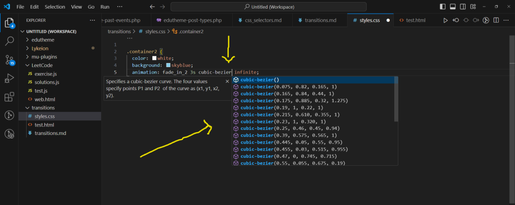
It is a good practice to take some time to experiment and play around with cubic-bezier, making subtle but meaningful tweaks.
VS Code’s autocomplete for cubic-bezier curves is great, offering a broad range of options.
Respect motion preferences
Transition effects may make some people uncomfortable.
Transitions and animations are quite similar but differ on how complex they are and how they are being triggered. The former are depended on user interaction and are less complex than the later, creating a simple change from one state to another.
While this case of visitors getting uncomfortable with transitions is not as frequent or severe as with animations, it can still be an issue. Thankfully, CSS has a media feature called prefers-reduced-motion that can identify a user’s preference for less motion on their device.
HTML:
CSS:
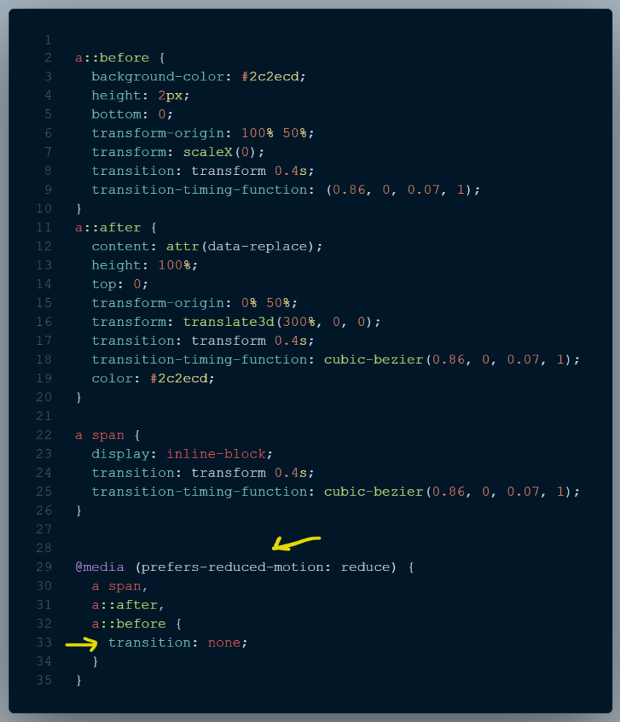
Here, the hovering effect may cause someone with cognitive impairments to feel confused since she wouldn’t expect such an animation from a simple hovering.
Using the prefers-reduced-motion media query, we enable users who have set their system preferences to less motion.
We can turn off animations in Windows 10 by pressing the Windows key, + U.