As a developer, you want to build beautiful websites.
In order to achieve this, components of your website, like images, videos, profile pictures, and cards, should keep the same shape as the screen change in size.
Components maintaining a consistent shape leads to a consistent layout. And a consistent layout is one of the main things that make a website good-looking.
The aspect-ratio property in CSS helps achieve this consistency. It tells browsers how the width and height of an element should relate to one another. As one dimension grows or shrinks, the other adjusts automatically to preserve the specified ratio.
Common aspect ratios
You can use the aspect-ratio property to create a square (1 / 1), a widescreen rectangle (16 / 9) or a more traditional display shape (4 / 3).
Setting an aspect ratio is simple.
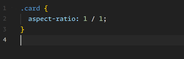
A practical example
Let’s say you’re building a gallery of product images.
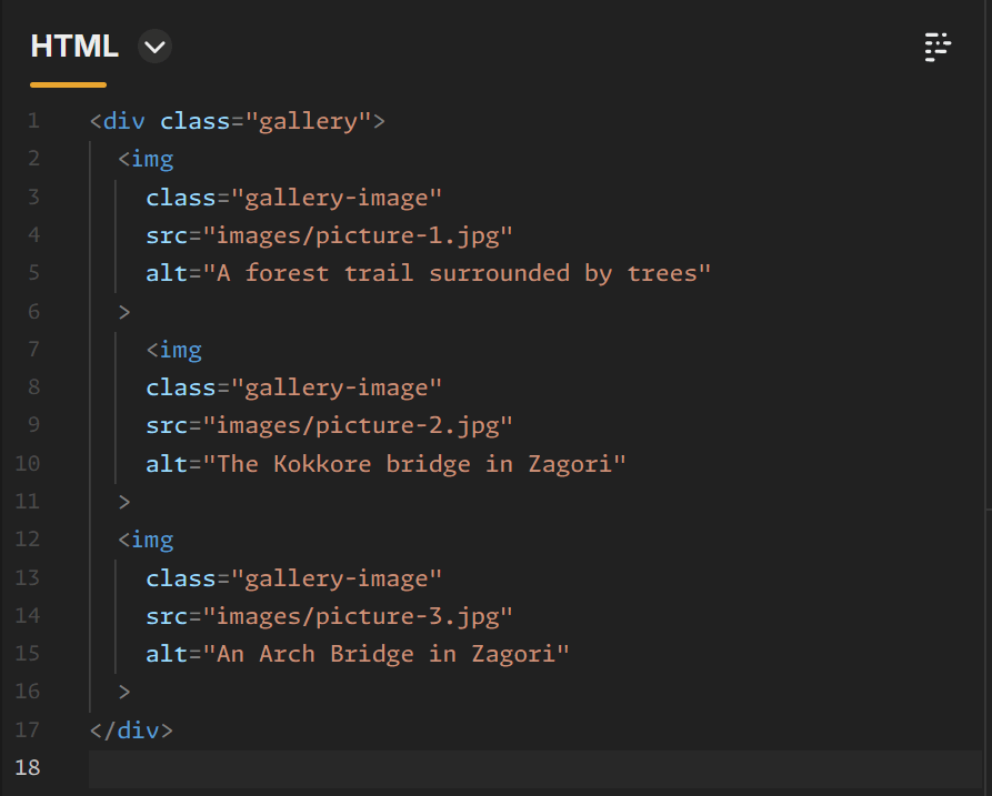
The 1/1 aspect ratio creates squares:

Result:
The result shows square images regardless of the fact that the original image files are in a classic 3/2 scale:
In our example, the original image doesn’t have a 1:1 ratio. But it’s scaled to fill the entire box without making images deformed.
As the layout grows or shrinks, every image keeps the same proportions. The gallery is more balanced because each image occupies the same amount of space.
NOTE: When used together, theaspect-ratioproperty andobject-fitwork effectively to determine how images fill their containers (see the above CSS example).
In which cases using the aspect-ratio property usually helps
Common examples include, but are not limited to, image galleries, video players, user profile photos and product cards.
When a layout needs to look orderly, using aspect-ratio is a great help.
Some important points to keep in mind regarding aspect-ratio
For the aspect-ratio property to work, the browser must be able to calculate one dimension from the other. For example, in many cases you specify only the width, and the browser calculates the height automatically.
But if both the width and height are specified explicitly, those measurements will take priority, making the aspect-ratio ineffective.
The aspect-ratio tries to create a square, but the width and height take precedence:
Final thoughts
With the aspect-ratio property, you can keep elements proportional using very little code, which makes it easier to create and manage responsive layouts.
This property is very useful for image galleries, video sections, or card layouts, as it helps deliver consistent results across different screen sizes.