When it comes to accessibility, two terms that people frequently confuse are aria-label and aria-labelledby. Both serve to give an accessible name to an element, which assistive technology uses to communicate with users. To put it simply, both respond to the same question: what is the name of this element?
The difference is where the name comes from.
aria-label provides the name directly as text inside the attribute. aria-labelledby points to visible text somewhere else on the page. That difference affects user experience.
What Is an Accessible Name?
An accessible name is the label that assistive technology uses to identify an element. For example, a button with visible text usually already has an accessible name.
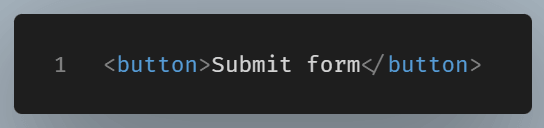
A screen reader can announce this as “Submit form, button.” No ARIA is needed because the button already has clear text.
But sometimes an element has no visible text. A common case is an icon button.

A sighted user may understand that this is a search button. A screen reader user may only hear “button,” which is not useful. This is where ARIA naming attributes can help.
What aria-label Does
The aria-label attribute gives an element a direct text label. You write the accessible name right inside the attribute.
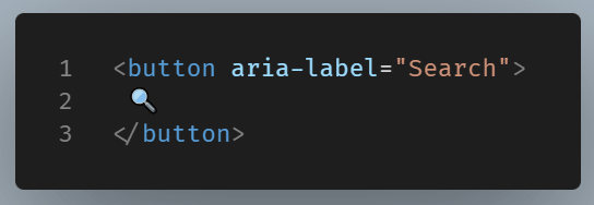
Now assistive technology has a clear name for the button. The visible button still only shows an icon, but the accessible name becomes “Search.”
This is often the simplest solution when no visible label exists.
Use aria-label when:
- the element has no visible text
- adding visible text would not fit the design
- the label is short and easy to understand
- the label does not need to be reused elsewhere
A close button is a classic example.
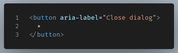
The symbol alone may be visually clear, but it is not a reliable accessible name. The attribute fixes that.
What aria-labelledby Does
The aria-labelledby attribute works differently. Instead of placing the label text inside the attribute, you point to another element by its id.
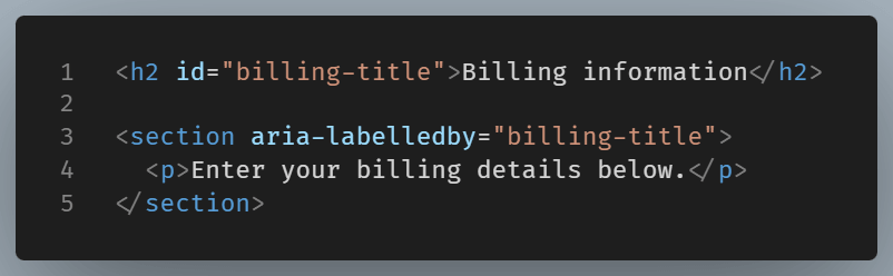
Here, the section gets its accessible name from the heading. The heading is visible on the page, and the section points to it.
This is useful because the label already exists. You do not need to repeat it. You connect the element to text that users can already see.
That connection is the main strength of aria-labelledby.
The Main Difference in Plain Terms
Consider the two attributes like this.
aria-label says: “My name is written right here.”
aria-labelledby says: “My name is over there. Use that text.”
That is the whole distinction.
With aria-label, the label is hidden from sighted users but available to assistive technology. With aria-labelledby, the label usually comes from visible text already present on the page.
This makes aria-labelledby better when a visible label exists. It keeps the visual interface and the accessible interface in sync.
A Form Example
Most form fields should use a normal <label> element.
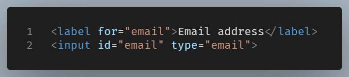
This is clear, and accessible, but sometimes a custom component needs ARIA.
Consider a group of controls.
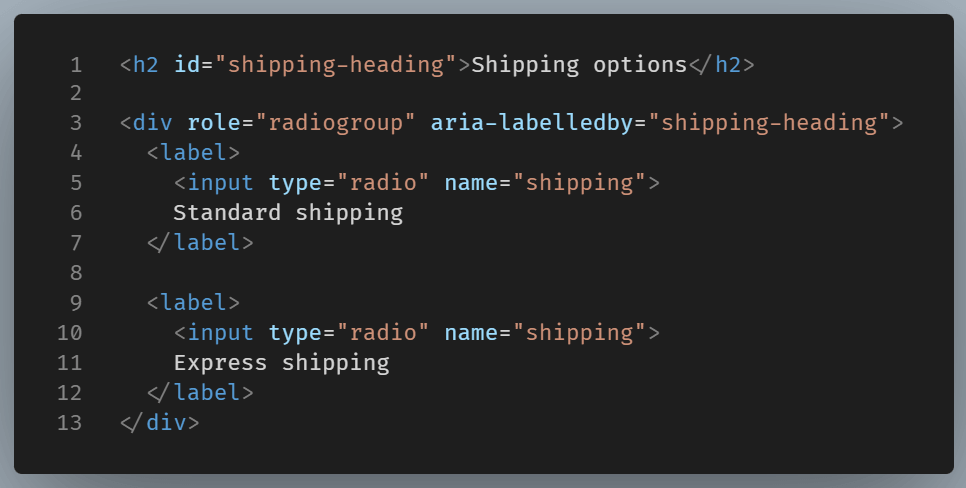
The radio group is named by the heading. This helps users understand the purpose of the group.
You could use aria-label here:

While that solution works, it does repeat text that is already visible. If they forget, the page may say one thing visually and another thing to assistive technology.
That is why aria-labelledby is often the better choice when visible text is available.
An Icon Button Example
Now consider the opposite case.
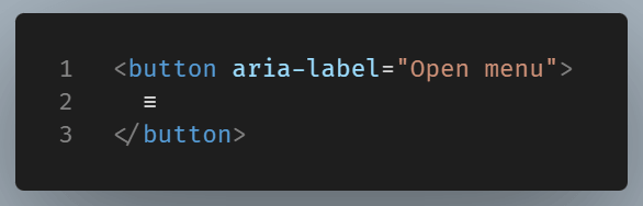
There is no visible text that says “Open menu.” The icon stands alone. In this case, aria-label is a good fit.
You could create hidden text and point to it with aria-labelledby, but that may be more complex than needed for a simple icon button.
This works, but for a small icon button, aria-label is usually cleaner.
When aria-labelledby Is Stronger
Use aria-labelledby when the label already appears on the page. This avoids duplication and keeps naming tied to visible content.
Good cases include:
- named sections
- modal dialogs
- card regions
- grouped controls
- custom widgets with visible headings
A dialog is a common example.
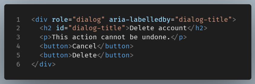
The dialog name comes from the visible heading. That is good for everyone. Sighted users see the title, and screen reader users hear the same title.
When aria-label Is Stronger
Use aria-label when no visible label exists and the text is short.
Good cases include:
- search icon buttons
- close buttons
- menu buttons
- carousel controls
- social media icon links
Example:
The link uses only an icon, so it needs a text name. aria-label provides that name directly.
Be Careful With Overriding Text
One common beginner mistake is adding aria-label to elements that already have useful visible text.
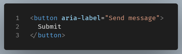
This can create some confusion. A sighted user sees “Submit,” whereas assistive technology might say “Send message.” These terms are related, but they don’t mean the same thing. This difference can complicate testing, support, and user guidance.
A better version is usually:
<button>Send message</button>Or, if the visible text must stay as “Submit,” avoid adding a different accessible name unless there is a strong reason.
Making something accessible goes beyond just implementing ARIA. The focus should be on communicating the information as clearly as possible.
Which One Has Priority?
If both aria-label and aria-labelledby are used on the same element, aria-labelledby generally takes priority in accessible name calculation.
That means this is usually unnecessary and confusing:
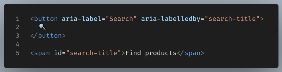
The browser and assistive technology may use the referenced text instead of the direct label. As a rule, avoid using both on the same element unless you have a specific reason.
A Simple Decision Rule
Here is a practical way to choose.
If there is visible text that already labels the element, use aria-labelledby.
If there is no visible text and the element still needs a name, use aria-label.
If HTML5 semantic elements can solve the problem, use native HTML5 first.
That last point is important. A real <label> for a form field is better than forcing ARIA into the design. A button with clear text is better than an icon button with a hidden label. ARIA is useful, but its job is to support good markup, not replace it.
Common Mistakes to Avoid
Beginners often run into a few repeating problems.
The first is using aria-label as a quick fix for unclear design. If visible text would help everyone, add visible text.
The second is pointing aria-labelledby to an ID that does not exist.
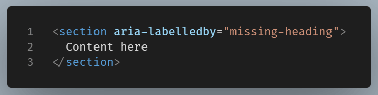
If no element has that ID, the naming relationship breaks.
The third is using vague labels.
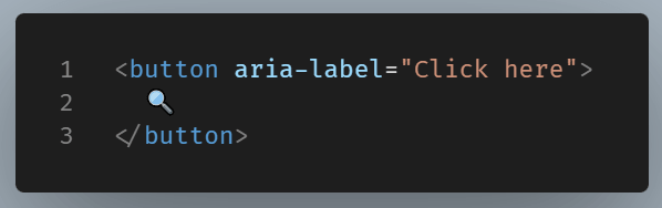
“Click here” does not explain the action. “Search” is better.
Good labels describe purpose, not mechanics.
Final Thoughts
aria-label and aria-labelledby both name elements for assistive technology, but they do it in different ways. aria-label writes the name directly into the element. aria-labelledby reuses text from another element on the page.
As a rule of thumb, prefer visible text. Connect to that visible text with aria-labelledby when needed. Use aria-label for interactive element that uses an icon, symbol, or visual cue instead of visible text.
By using this approach, your interface stays clearer for more users, and your code becomes easier to maintain.