Modal dialogs can be either helpful or deeply frustrating. It depends entirely on how they’re used. A well-designed modal focuses attention and helps users make a decision. A poorly designed one, on the other hand, blocks the experience, causes confusion, and gets closed immediately.
Let’s talk about how to do it right.
Best Practices for Designing Modal Dialogs
Use Modals with Purpose
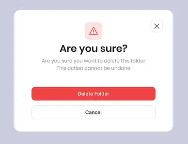
Use modal windows if you need to interrupt the user. They are great at directing attention. A modal window can show an alert, a warning, or a confirmation message.
If it’s not urgent, or if it interrupts a user’s flow for no good reason, consider another pattern.
Keep It Focused and Simple
Modals should have a single, clear purpose. Don’t overload them with too many options, inputs, or text blocks. Users must understand the modal’s point immediately.
Use clear headers, concise instructions, and well-labeled buttons with for example Cancel and Confirm as values, not just “OK.”
Make Them Easy to Dismiss
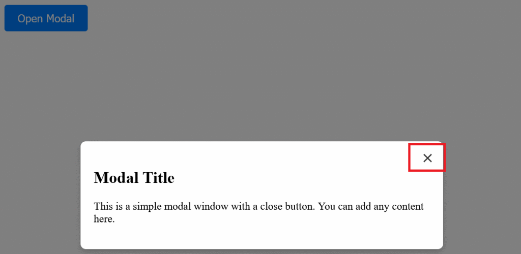
Always give users an easy way out. A visible close button (usually in the top right).
Don’t trap users inside. That’s not good UX!
Ensure Accessibility
Modals should be accessible to everyone.
- Trap Focus Inside the Modal
When a modal opens, the user’s keyboard focus should move into it and stay there until the modal is closed. This prevents users from accidentally tabbing to elements behind the modal (which can be confusing or disorienting).
Use JavaScript or ARIA utilities to trap focus:
- Focus should start on the first focusable element inside the modal (like a close button or input field).
- Tabbing should cycle within the modal, not go beyond it.
- Use ARIA Roles and Labels
These tools assist screen readers in understanding the modal’s design and intent:
Add role="dialog" or role="alertdialog" to the modal container.
Use aria-modal="true" to signal that the rest of the page is inert.
Add aria-labelledby and/or aria-describedby to associate a heading and description with the modal.
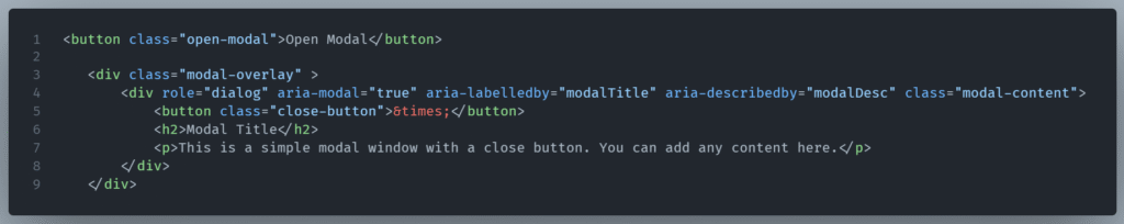
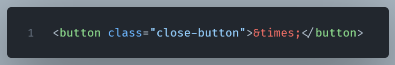
3. Provide a Clear and Visible Close Option
Make sure the close button:
- Is keyboard-focusable,
- Has a label like
aria-label="Close modal", - And appears consistently in the UI (usually top right).
4. Disable Background Interaction
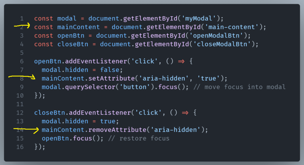
When a modal is open, users shouldn’t be able to interact with the rest of the page. Visually dim the background, and for screen readers, hide the rest of the content using aria-hidden="true" on the main content area.