Card design seems simple, but it can be complex. On the surface, a card is nothing more than a container. A handy little box for content. But it can define how users scan, engage, and understand what you’re showing them.
Cards are everywhere: product listings, article previews, dashboards. They’re versatile, but that’s exactly why they need thoughtful design.
What Are Best Practices for Designing Cards?
Keep the Structure Clean and Predictable
Cards work best when they follow a clear structure. Typically, this includes a title, image or icon, a short description, and acall to action (like a button or link). Not every card needs all these elements, but if they’re there, they should be in the same order, constantly.
Inconsistent layouts confuse users. Predictability in this case is a good thing.
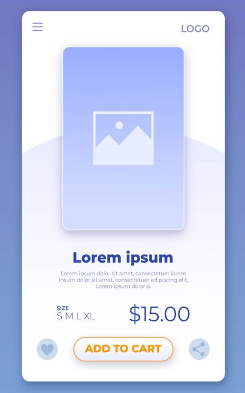
Implement Visual Hierarchy
Not everything on a card deserves the same visual weight. A card should guide the eye from top to bottom, or left to right. Use font size, spacing, andcontrast to highlight what matters most: usually the title or the primary action.
Remember that white space is helpful. A busy card resembles noise.
Make It Clickable
If the whole card is clickable, make that clear. Use hover effects, shadows, or borders to show interactivity. But don’t turn cards into surprise buttons. If only part of the card is clickable—like a button or link—make sure users can tell the difference.
Keep Cards Flexible
Cards should respond well to different screen sizes. That means avoiding fixed widths when possible and letting cards stack gracefully on mobile. Responsiveness is not optional, it’s essential.
Use them purposefully
Just because cards are popular doesn’t mean they’re appropriate in every context. Use them to group related information. Avoid overusing them in places where a list or table would do the job better.
Wrapping Up
Visual appeal isn’t the only factor in card design. Clarity and consistency are also key. If done right, cards create small, simple spaces that are easy to use without any second guessing.