We don’t need a complex framework or a JavaScript solution to deliver responsive images.
HTML5 provided a simple solution: the <picture> element.
One Image Doesn’t Fit All
Let’s say our website loads a beautiful image that works fine on a desktop.
But that same image on a mobile phone would probably be oversized, slow to load, and may even be clumsily cropped.
You could shrink it down with CSS, but that still downloads the full-size image, thus wasting bandwidth and slowing performance.
The fix to this is the <picture> element.
What <picture> Actually Does
The <picture> element lets you define multiple versions of the same image and tell the browser which one to load based on screen size, resolution, or file type. It works like this:
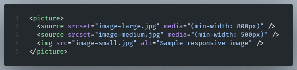
In this example:
- A large image is shown on screens wider than 800px.
- A medium image for anything between 500px and 800px.
- A small fallback image is shown on screens under 500px—or if the browser doesn’t support the
<picture>element.
Why This Works Better Than CSS Alone
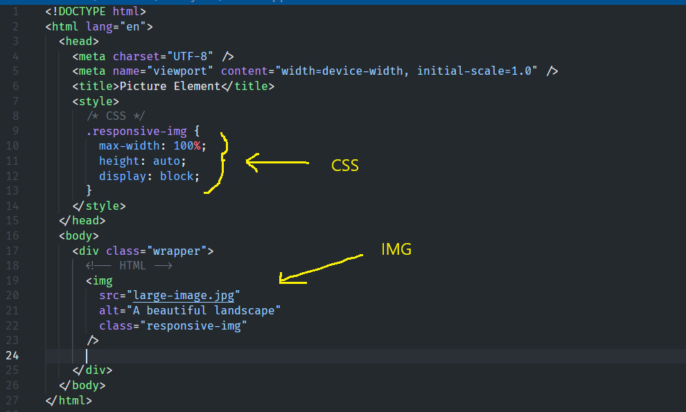
We could use just one <img> tag and scale it down with media queries or max-width: 100%.
What This Does
max-width: 100%ensures the image never exceeds the width of its container.height: autokeeps the image’s original proportions.display: blockprevents any weird spacing (images are inline by default).
So, if you put this image inside a <div> or a column that resizes with the screen, the image scales down nicely. It is effective, but not the best approach overall.
That works visually but it doesn’t prevent the browser from downloading the biggest version of the image every time even on small screens.
So mobile users get hit with unnecessary load time and data usage.
Every device is slowed down by your biggest image.
But still this approach is okey to use when only a single image size is available for use or when performance is not critical for that image (like in the case of a decorative icon) or even when we work on a prototype.
With <picture>, the browser only downloads the image it needs. This translates to quicker loading, reduced data consumption (especially on mobile), and enhanced performance.
Bonus: Includes support for modern image formats.
Modern image formats such as WebP and AVIF, which offer better compression than JPG or PNG, are also supported by the <picture> element.
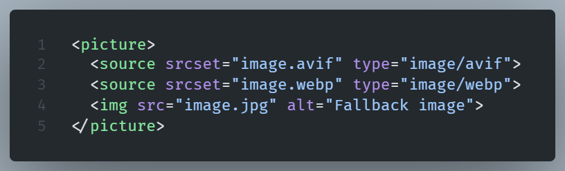
Browsers will chose the best format they support without you needing to do extra work.
NOTE: Always include a regular <img> tag as the last child of your <picture> element. If none of your <source> elements apply, the browser will use that final image. Think of it as your safety net.
Is the picture element redundant in WordPress?
Let me elaborate.
Sort of, yes, but the answer depends on your actual needs.
When you upload an image in WordPress, it automatically creates several sizes: thumbnail, medium, large, etc.
Then, when you insert that image into a post or page, WordPress uses the standard <img> tag with srcset and sizes attributes.
This way, it lets the browser know that there are a few sizes of the image available. It’s now up to it to choose the most appropriate one based on the screen width.
That handles most responsive needs without any effort on your part.
So in that sense, yes, WordPress is already handling basic responsive images for you, right out of the box.
For most everyday blog posts or pages, WordPress’s automatic responsive images via srcset are good enough.
When the <picture> element remains relevant for WordPress
You want to use in a WordPress environment if you want to:
- Serve different crops of the same image (e.g. landscape for desktop, square for mobile)
- Use different file formats (like WebP, AVIF, or fallback JPEGs)
- Use different visuals depending on screen size or device (e.g., a simple image on mobile, a detailed one on desktops).
Then srcset by itself is not sufficient. You’d need the <picture> element to control that level of behavior.